Top Forex Brokers
What is Chart Trading?
Chart trading, a major part of “technical analysis,” is when you use a price chart to make trading decisions, i.e., whether to buy or sell. Popular chart trading techniques include support and resistance analysis and using chart patterns such as double tops and head and shoulders reversal patterns. Chart trading is a big topic, but it starts with deciding what type of chart to use.
There are three categories of chart types: time-based, activity-based, and price-based.
Time-based charts:
- The most widely used types of trading charts.
- Line charts: connecting closing prices with a line.
- Bar charts: displaying each period’s open, high, low, and close (OHLC) as a vertical bar.
- Candlesticks: displaying each period open and close range as a vertical block and the high and low as “wicks.”
Activity-based charts:
- Volume charts: Each candle is formed at regular volume intervals.
- Tick charts: Each candle represents a set number of ticks or transactions.
- Volume profile: combines volume and time-based charts to show volume traded at different price levels.
Price-based charts:
- Range charts: a bar or candle is created when the price moves by a specified price range, e.g., 100 pips.
- Point and Figure charts: Columns of Xs for rising prices followed by columns of O’s for falling prices.
- Renko charts: These charts look like a series of bricks that print when the price has moved a certain distance from the previous brick.
- Kagi charts: They change direction once the price reverses by a certain amount.
Let’s look at each in turn, in more detail.
Time-Based Charts: Line, Bar, and Candlestick
There are three main types of time-based charts – line, bar and candlestick – and they dominate trading. Every trading platform will have these options and allow you to easily change between them.
What does “Time-Based” mean?
- The chart will advance by the time-interval setting you choose, and the horizontal scale at the bottom of the chart will then represent regular units of time. For example, if you choose the daily timeframe, each interval on the chart will represent that day’s price range. If you choose the hourly timeframe, each interval will represent a single hour of trading.
- Time-based charts can be as small as one-minute increments of trading (known as one-minute charts) that usually show a day or a few days of trading. High timeframes can go up to monthly charts that cover decades worth of price movement across the chart in monthly increments.
Let us look at each one in more detail.
Bar Chart
What is it?
- A vertical bar marks the high and low of the period, with a “foot” for the open and the close. Now you are getting more detail than the line chart.
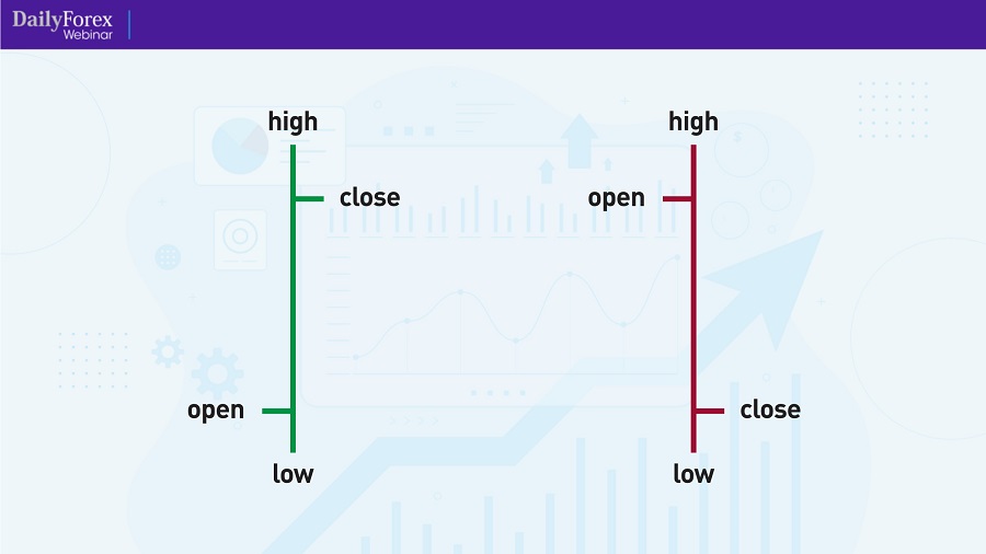
Anatomy of Price Bars
Tip: Play with the colour settings on your trading platform to help identify bearish bars (with the close lower than the open) separately from bullish bars.
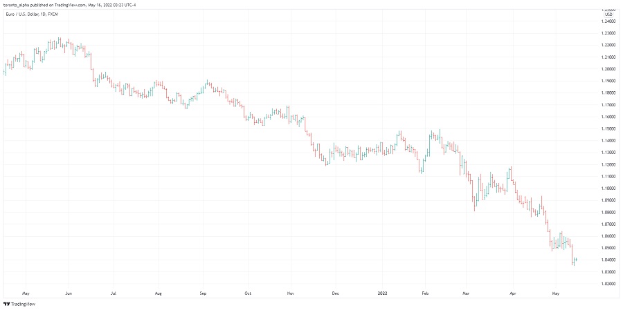
Daily EUR/USD Bar Chart
Why use Bar Charts?
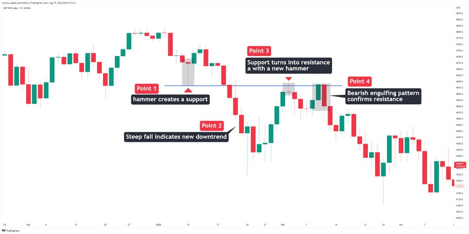
- Bar charts are great for technical analysis, such as spotting support and resistance levels and chart patterns such as head and shoulders or double tops. Bar charts show the same information as candlestick charts, but some people find them visually easier to see trends or levels against which the price bounces.
MetaTrader shortcut:
Alt+1 will convert any chart to a bar chart.
Candlestick Chart
What is it?
- The “body” of the candle shows the range between open and close, and the “wicks” show the high and low.
- You will sometimes hear them called “Japanese Candlesticks” because they originated in Japan.

Anatomy of Candlesticks
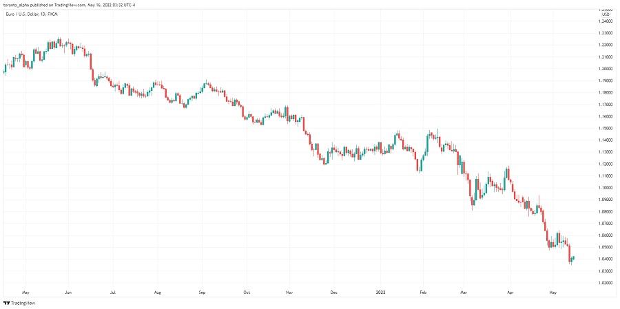
Daily EUR/USD Candlestick Chart
Why use candlesticks instead of bars?
- Candlesticks are the most popular type of trading chart, and many traders use nothing else. Even though candlesticks and bars show identical information (open, high, low, and close), traders often find it easier to spot price patterns using candlesticks.
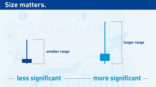
- For example, it is easy to spot candles that have moved heavily in one direction, especially when they have opened and closed near the ends of their range.
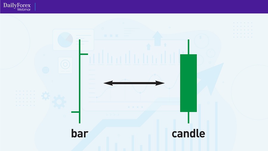
Bar vs Candlestick
- Look at this example below of a daily price chart and see how much better visibility you can get in a candlestick chart compared to a bar chart:
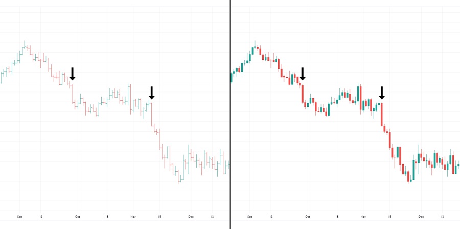
Bar Chart vs Candlestick Chart
Another good example is one of my favourite reversal patterns consisting of two candles with the following rules:
A bullish candle with a body at least two-thirds of the day’s range, and:
Immediately followed by a bearish candle with a body that’s again at least two-thirds of the day’s range.
The second candle’s body must cover the range of the first candle’s body.
For a reversal in the other direction, it is a bearish candle followed by a bullish candle with the same rules.
See how much easier it is to see this pattern with candles compared to bars:
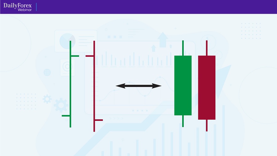
Bar Pattern vs Candlestick Pattern
And here is that pattern on an actual chart, a daily EUR/USD chart, on both bars and candles:
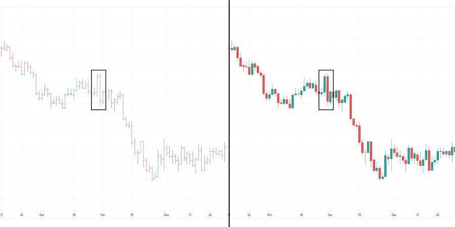
Bar Chart Pattern vs Candlestick Chart Pattern
If I am looking for the bigger picture and not concerned about individual price moves, I will switch from candlesticks to bars because it is visually simpler.
MetaTrader shortcut:
Alt+2 will convert any chart to a candlestick chart.
Line Chart
What is it?
A line chart connects the closing prices at regular periods, e.g., every day in a daily chart to form a line.
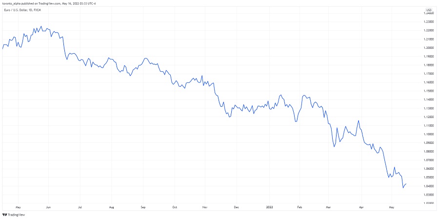
Line Chart
Why use Line Charts?
- A Line Chart is the simplest way to see price changes. You can very quickly get a snapshot of how price moved. For that reason, if you see a chart on a mainstream media outlet such as Bloomberg or CNN Money, they almost always use a line chart.
- Line charts are great for higher time frames, e.g., daily, or weekly time frames. The closing prices at the end-of-day or end-of-week, are significant. Market noise can obstruct you from seeing the bigger picture, and I have seen clean support or resistance on a line chart that I missed on the same candlestick chart.
What are the limitations of Line Charts?
- You can easily miss information reading a line chart. As you are not seeing the high and low ranges in a line chart, you can miss expanding volatility, or other important levels created by the price that is not reflected in the closing values.
Remember, you can look at the same picture with both a line chart and a candlestick.
I have never placed a trade using only a Line chart—I will switch back and forth between a line chart and a candlestick chart.
MetaTrader shortcut: Alt+3 will convert any chart to a line chart.
Key takeaways:
- Time-based charts are the most popular category of charts.
- Candlestick charts are the most popular time-based chart used by traders.
- Bar charts & candlestick charts show the same data, but many find candlesticks easier for spotting chart patterns.
- A line chart offers simplicity to see the big picture. They are especially beneficial for daily and other higher timeframes.
Activity-Based Charts
Some traders consider units of time an arbitrary measure when used in a chart, so instead, they prefer to use set levels of activity to form each candle or bar. Let us explore the most popular activity-based charts: volume and tick charts.
Volume Chart
What is it?
- A volume chart has each candle formed at regular volume intervals instead of regular time intervals.
What volume setting should you use?
- A good place to start is to look at the trading volume during timeframes you normally use. Let us say you trade a stock on daily charts with an average daily volume of 100m shares. You can set your volume chart to 100m as a starting point, and a new candle would appear after every 100m shares are traded.
Why use volume charts?
- Volume charts smooth out periods of inactivity because inactivity creates fewer candles. You can still use many technical analysis techniques such as support and resistance and moving averages on volume charts.
What are the limitations of volume charts?
- Markets without a centralized exchange like spot Forex do not have standard volume data. You are relying on your broker’s volume data, or Forex futures volume data, which may not correlate with the overall spot market.
Tick Chart
What is it?
- A tick is a single transaction, and a tick chart prints a candle at regular tick intervals. Tick charts are not the same as volume charts as each tick can have different volume sizes.
Why use tick charts?
- Short-term traders and scalpers love tick charts. When you trade using timeframes under 5-minutes, the movements can become very choppy as the price jumps about from one period to the next. Tick charts do an excellent job of smoothing that out. If there is an extended period of inactivity, you will see fewer candles, and then when activity picks up, more candles will appear.
What tick setting should you use? Some traders use Fibonacci numbers such as 144 or 233-tick charts.
What are the limitations?
- Like volume charts, markets without a centralized exchange do not have standard tick data. You are relying on your broker’s data information which may not correlate with the overall market.
Volume Profile (or Price by Volume) Chart
What is it?
- Volume profile shows the volume traded on the vertical axis as a horizontal histogram overlaid on a time-based chart.
Volume Profile Chart
Why use volume profile?
- Seeing volume traded at different price levels can show which levels might be more important in the future and function as support and resistance.
- It gives the best of both worlds: time-based charts plus volume data.
What are the limitations?
- Volume profile needs historical and accurate volume data to be useful, and that is not always possible in decentralized markets without an exchange, such as spot Forex.
Key takeaways:
- Activity-based charts use volume or ticks instead of time to construct the intervals.
- There are plenty of volume indicators that you can use in time-based charts to incorporate volume into your trading if you do not want to use volume or tick charts. This can give you the best of both worlds: time-based charts and volume information.
Price-Based Charts
These types of charts only consider price movements, i.e., not time or volume, in their construction. They aim to filter out noise and give clear indications of important price levels.
Range Charts
What is it?
- A candle or bar is created when the price moves by a specified price range, e.g., 100 pips, and then the next bar is created.
- Every bar is identical in length and either closes at its high or low.

Range Chart
Why use range charts?
- Range bars can help cut out the noise. For example, a lot of noise happens when the price bounces around within a narrow range, but instead of presenting this extended period as many bars in a regular time-based chart, a range chart will reduce this to just a few bars.
What are the limitations?
- As range bars are based solely on price, and not time or volume, they can hide areas where price spends a lot of time & trading activity building up strong support or resistance. This limitation is true for all price-based charts.
You can still use classic technical analysis such as support and resistance analysis on range charts.
Point and Figure Charts
What is it?
- A point and figure (P&F) chart draws an “X” every time the price moves up by a certain amount, known as the box size.
- It will continue to draw Xs in the same column as the price moves higher.
- If the price moves down by a certain amount, it will draw an “O.” But to start a new column of O’s, the price must move by a minimum number of box sizes.
Point and Figure Chart
- The box size can be set as a dollar amount, e.g., for a stock, a percentage, or based on volatility using an Average True Range (ATR).
Why use P&F charts?
- P&F charts can show very clean areas of support & resistance as they filter out a lot of market noise.
- P&F charts can reduce false breakout signals. A false breakout is when the price breaks out of a level but does not continue its momentum and instead reverses.
What are the limitations?
- They can be slow to react to price changes because the price must move by a minimum amount before it shows a reversal in trend.
How do you trade P&F charts?
- You can use classic support and resistance in point and figure charts.
- This type of chart has its own body of knowledge, and I recommend looking at some of the dedicated tutorials on P&F charts to investigate further.
Renko Charts
What is it?
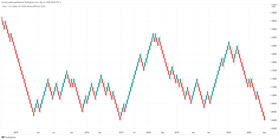
- Renko charts print a new “brick” when the market moves more than the brick size away from the preceding brick.
- Renko charts filter out price action that is smaller than the brick size.
Renko Chart
Why use Renko charts?
- Renko charts are excellent at highlighting trends by ignoring smaller price moves.
What are the limitations?
- As Renko charts are based solely on price, and not time or volume, they can hide areas where price spends a lot of time & trading activity building up strong support or resistance. This limitation is true for all price-based charts.
- You will not be able to see many classic technical analysis patterns, such as rounded tops, or wedges, when you use renko charts.
Kagi Charts
What is it?
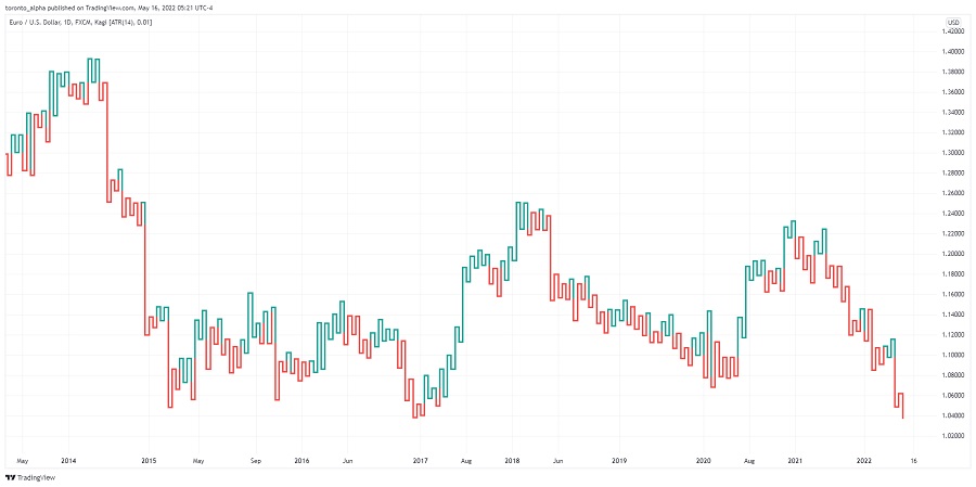
- When price reverses and moves in the opposite direction by a specified reversal amount, the chart will change direction.
- Two lines make up a kagi chart: the yang line when the price goes higher than a previous swing high, and the yin line when the price breaks below a prior swing low.
Kagi Chart
Why use Kagi charts?
- They are great at highlighting the breakouts of previous highs and lows and simplifying the direction of highlighting trends.
What are the limitations?
- Kagi charts can be difficult to interpret visually because of their unique construction, and they take some practice to use.
- As kagi charts are based solely on price and not time or volume, they can hide areas where price spends a lot of time and trading activity building up strong support or resistance. This limitation is true for all price-based charts.
Key takeaways:
- Price-based charts filter out a lot of noise to help you better identify trends and important price levels.
- The common limitation is that the price can spend a lot of time and trading activity building up strong support or resistance, but it is rarely seen on a price-based chart.
FAQs
How many types of trading charts are there?
There are at least a dozen different types of trading charts. They can be divided into 3 main categories: time-based, activity-based, and price-based.
What are the 5 types of trading?
The five types of trading are scalping, day trading, momentum trading, swing trading and position trading. The differentiator between each type of trading is the time frame and time horizon. For example, a scalping trade can last less than ten minutes, and a swing trade can last several days.
Is a head and shoulders pattern bullish?
If the head and shoulders pattern is three tops, then it is a bearish pattern. If it is three bottoms, it is a bullish pattern. When the pattern consists of three bottoms, it is called an inverse head and shoulders.
What type of chart trading is best for beginners?
Time-based charts, particularly candlestick charts, are a great place to start for beginners.

