My name is Huzefa Hamid, and I'm a senior analyst at DailyForex, as well as a Forex and futures trader. I’ve been trading for just over a decade, having started as a U.S. equities trader. I trade mainly Forex now and some futures contracts (the S&P 500, for example). Occasionally, I trade commodities like crude oil or natural gas, but most of my trading is Forex. I use technical analyses for all my decision making.
It’s really all about the price chart for me. I do take into account the economic calendar in terms of what’s going on out there – some weeks ago was the U.S. presidential election, for example, and I didn’t want to enter any new trades – but I use a price chart to figure out where I am in the market and what I’m supposed to be doing.
There are five keys to support and resistance that helps us understand some of the foundational concepts around support and resistance. When I first look at a chart, I think the first thing to consider is the market condition. That’s the basis of everything. Are we in a trend? Are we in a range? If we’re in a trend, what part of the trend are we in? Are we in the impulsive part or is the market correcting, etc.? From there, you can figure out your support and resistance levels. That’s part of the foundation of where to begin when looking at the chart.
Now, you might have found yourself asking a bunch of questions around support and resistance. What is support and resistance? How do you find support and resistance levels? What are “key levels” in Forex? What is a good support and resistance trading strategy? How do you trade with support and resistance?
What is Trading Support & Resistance?
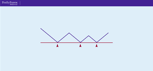
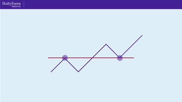
Let’s begin by defining support and resistance levels. This is a simplified diagram of a price chart:
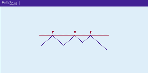
You can see it’s formed a support line there. When we talk about support and resistance, we are specifically referring to a horizontal line, a level where the price has stalled or stopped. So anything that has an angle to it is either a trend line or part of a chart pattern. Support and resistance to us is the horizontal basis. The line in the diagram above is a support line, but price can also come up to a level and stall which gives you a resistance line, like in this simplified diagram:
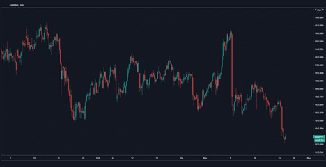
Let's take an example of support and resistance using an actual chart. This is the 240-minute, or four-hour, chart for gold:
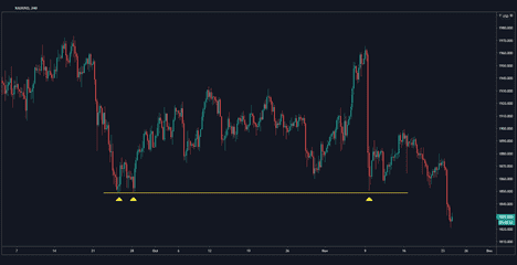
You can see that it’s in a bit of a range, but I’ve identified a key support that I’ve marked out with a yellow line, which you can see here:
Eventually, that support level gets broken, as you can see at the end of the chart. But this is just an example of what a support level looks like, using the price of gold over a four-hour candle.
Key number one: Trade support and resistance levels from the higher time frame
This is a key that you can apply to any type of technical trading, which begins with this concept of referring back to the higher time frame.
What do I mean by that? Let's start with some of the key time frames: there's the five-minute, 15-minute, 1-hour, four-hour, daily and weekly. There are other time frames in between and even beyond those, but these are the majority of time frames that people watch.
I like to put an imaginary line between the one-hour and the four-hour. Anything at the one-hour or below I consider to be the short time frame or lower time frame. Anything at the four-hour and above I consider to be a higher time frame. I use the higher time frames – four and above – to find my key support and resistance levels. No matter what time frame I’m trading, I always make sure those levels are marked out on the four-hour charts and above.
I can also execute based off those charts. When I’m looking at the lower time frames, I'm looking for execution. Since the 15-minute or one-hour support and resistance are just not going to be as strong or valid as the higher time frames, I look at the higher key support and resistance levels from the four-hour and above charts and then go into the lower time frames – one-hour and below – to execute.
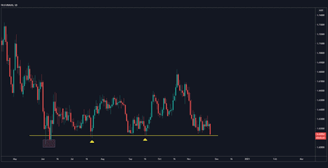
Let’s look at an example using the daily chart for the EUR/AUD pair:
Each candle represents one day’s trading. You can see it’s trended down and made a support line. Where you see the second yellow arrow (to the right), is where I’ve marked the key support level. The reason I’ve used this level as support is because this is where I saw the most price reaction and the most rejection.
When you’re looking at these markings of support, think about how often the price has closed or dipped below it. You can see in the first yellow arrow that it has breached the support level, but rejected it. It didn’t close above it. When it did close below for the day, it reversed the very next day, which was a swift rejection.
The primary reason I’ve used the support level is the price reaction, which is valid because of the way the price has reacted to it before. Interestingly, the price has just come down and it’s now sitting at this support level on the daily chart. So I might say to myself: OK, I wouldn’t mind trading a reaction to that level. But I would be cautious because it’s trending down. So I prefer to trade with the overall trends – here, with the resistance over support – but it’s sitting at a key level which doesn’t happen very often. Remember, this is a daily chart and it's going back to June of this year.
Now let's zoom in to the 15 minute level:
This is the same support level, but with 15-minute candles. You can see there’s been a big drop, but the price has begun to stall. It’s made shorter and shorter red candles and then eventually made green reversal candles. You typically won’t be able to pick that up on the daily chart by itself; when you do, it’s because the price has made a very big reversal and you’re looking for an entry somewhere.
You can see in this chart that it's made a nice reversal, and it's a trade you can catch with a very tight stop just below the line, because it’s now made that stall. So now, with the 15-minute level, you can get into tighter entries and have higher rewards compared to your risk. In other words, you can have tighter stop losses. As you see, we've gone from the daily chart to the 15-minute chart in trading the same support level. Whenever you trade support and resistance, you want to make sure you're using at least two timeframes, like I did here. I used the daily chart to identify my key S/R levels, and the 15-minute chart for my execution.
Key number two: finding support and resistance
Always ask yourself: where has price reacted? When I started trading support and resistance, I was always interested in the number of touches. But as I got better as a trader, I realized that it’s really about how price reacted at certain levels. So I want to make a distinction that when you’re looking for support and resistance, look to see where the reaction is, not necessarily how many times it has touched. If it touches more that’s great – it makes that level stronger usually – but you're really looking for the reaction.
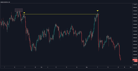
Let's go back to gold as an example and look at the four-hour chart:
Look at that chart for a moment and ask yourself: where can you see resistance? Where would you have marked resistance? You can see where I've marked my resistance level up above. I did that because this is really where price started to fall. This is where order flow came in – i.e., where the selling orders came in – and where the imbalance to the bearish side happened. It's really where the market started to fall.
Key number three: support and resistance role reversal
I actually started to learn how to trade and make money using support and resistance by studying role reversal. The idea of role reversal is that support will become resistance and resistance will become support. Let's start with a simplified diagram:
Take a look at this uptrend. The price has been trending up, but if you look closely you can see that resistance eventually gets broken and turns into support. This happens when a bunch of sellers decide that they want to cover their positions, and there's a lot of crowd psychology and technical reasons why that happens.
If you go to FXAcademy.com there’s an entire lesson on support and resistance, and I’ve written an article on DailyForex.com explaining the mechanics behind why support and resistance reverse roles. That may be helpful as an extra resource and as background information about why that happens.
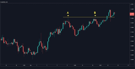
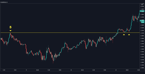
Now let’s look at that on a real chart. This is the GBP/USD four-hour chart:
The four-hour chart is my sweet spot, where I find many of my great trades. It’s short enough to find multiple trades, but it’s long enough so that I don’t have to be sitting at the screen all the time. You can see that the price has been trending up. It made two resistance levels here and then it eventually broke through.
You can see that I’ve labeled these two resistance points A and B (an arbitrary decision, on my part). Now let's zoom in to the 15-minute chart:
This is the same point B that you saw on the four-hour chart levels, and you can see that there's a strong reaction there.
As it comes back up towards the right side of the chart, it makes a decisive push through. Then it makes a tepid, small correction. A small or weak correction is what we want, really, because if you want to trade on the bullish side, the candles should be small. No long wicks, no long bodies; nice, tight candles. It makes two touches nice and neatly, marked by the arrows. You can barely see that on the four-hour chart, but here it’s very clear on the 15-minute chart. That’s the key: you’re looking at one or two time frames to really hone in on your support and resistance levels. In this instance, you can see that they reversed roles.
Many people ask about the support and the resistance indicators. The indicator for support and resistance is the actual context of the chart. What is the chart doing? What is the higher time frame doing? That’s really your indicator, or your “thesis”. What I just showed you above is an actual trade and it can be as simple as that. When it’s clean and lines up, you can pick off some really great trades using support and resistance.
Let me give you a quick analysis of how I found that trade. The price had been trending up and made a very clean resistance to the pip, which doesn’t happen very often, but it did in this case. It pushed through, stalled nicely and I was able to get in.
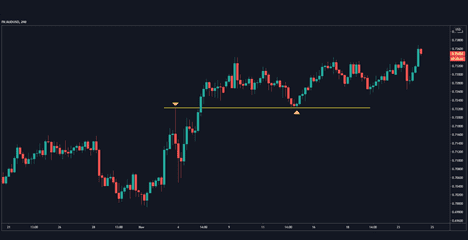
Here's another example, just as clean, with the AUD/USD's four-hour chart:
You can see by the first arrow how it made one touch and had a massive reaction. Even though there was only one touch, the reaction was enough to call that a resistance level. It then comes back over and down and stalls nicely. There were trades that you could pick off there in the lower time frames. If you were to zoom into the 15-minute chart you could find trades there. You could even do this just off the four-hour chart itself, it’s quite clean; but you can probably find a tighter entry in the lower time frames.
Key number four: using support and resistance to catch trends.
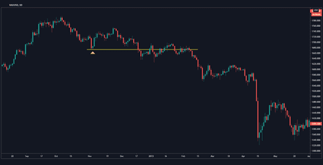
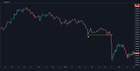
Trends are going to be the most profitable market condition. It means the market has shown you direction or bias. It’s showing you the way it wants to go. That’s where you can make a lot of consistent money. You can use support and resistance to find your place to get into that trend. Here is gold's daily chart:
This is quite an old chart – from 2012-2013 – when gold was trending down. Let's start at the top of the trend. Obviously, at the top of the trend, you don’t know it’s going to be a down trend, because the price has been trending up.
You can see where I've marked my first support. It clearly was broken, and the price then hovered just above it. Now keep in mind that downtrends are always defined by lower highs (and uptrends by higher lows.) So we have a lower high and then it breaks support. Then, it hovers back around giving you plenty of opportunities. It doesn’t quite test it as resistance – it comes back up and breaches it – but it hovers around that line, and you can tell that that’s the line that matters now. So you have a resistance, then a lower high, and then another set of lower highs. Now you’re starting to see a downtrend in play. It's getting tighter; you can see the price structure is flattening out. When there are multiple entry points, the price collapses.
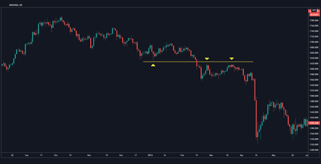
Let's look at this one, which is more of a role-reversal situation:
You can see here that support here gets broken decisively, and then is tested as resistance.
In this chart I want to draw your attention to how there was a large breakthrough here, where the price just drops right down. You might have found something more on the 15-minute chart, but clearly at this point it's in a very defined downtrend.
This ties in a bunch of principles. Using the higher time frame allows you to see the larger picture, the context. The concept of support and resistance always makes sense when you understand the context. Then, you can identify a trend and, when you find the internal support levels, see the fine entries to get into that trade.
Key number five: mind your risk.
There are three essential pillars in minding your risk: 1.) Always set a stop loss. For every trade that you place, make sure it’s not above a certain percentage of your account if you get stopped out, if the trade goes against you. A rule of thumb is one or two percent of your account risked per on every single trade. 2.) Aim for a positive risk reward ratio. You want to make sure that your profit is higher than the amount of your stop loss, or higher than your amount of risk. You want the ratio to be at least one-to-one, but higher if you can grab it. 3.) Set a percentage risk on your account for each trade. With these three pillars you can manage the risk of all your trading.
Final thoughts:
If the chart isn’t clear, stay away. If you’re having to eyeball it too much or squint or really look hard at it and you can’t find the points in the chart, just go to a different chart. There are dozens of Forex pairs – including eight majors – so you can always go to a different pair or a different time frame. But if you really can’t see the levels, wait until they become clear or just stay away from that chart for that time being.
LIke what you've read? See our other webinar recap on How to Trade Breakouts here!

