One of the most important things to learn when trading in Forex is conducting a weekly market analysis. In this webinar, I'll explain how to do that by looking at the economic calendar and seven major pairs, but first I should explain my trading style.
If you're not yet familiar with it, you'll soon see that I primarily use technical analyses for my trades. While I study economic calendars to gauge what moves the market, I don't use fundamentals, CPI/PMI numbers or interest rates announcements for my decision-making process. Rather, I use price charts and support/resistance trends.
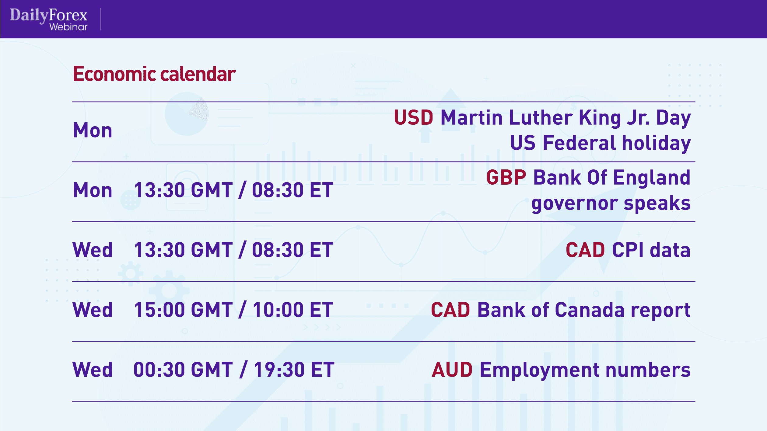
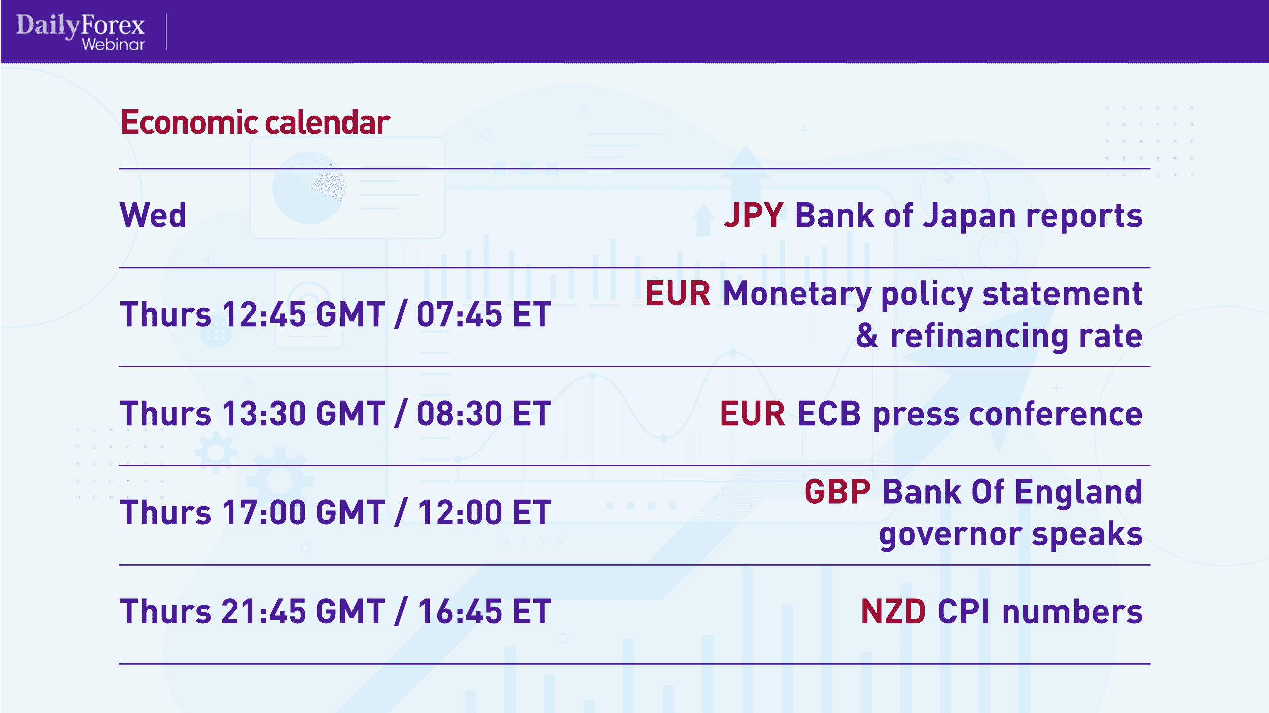
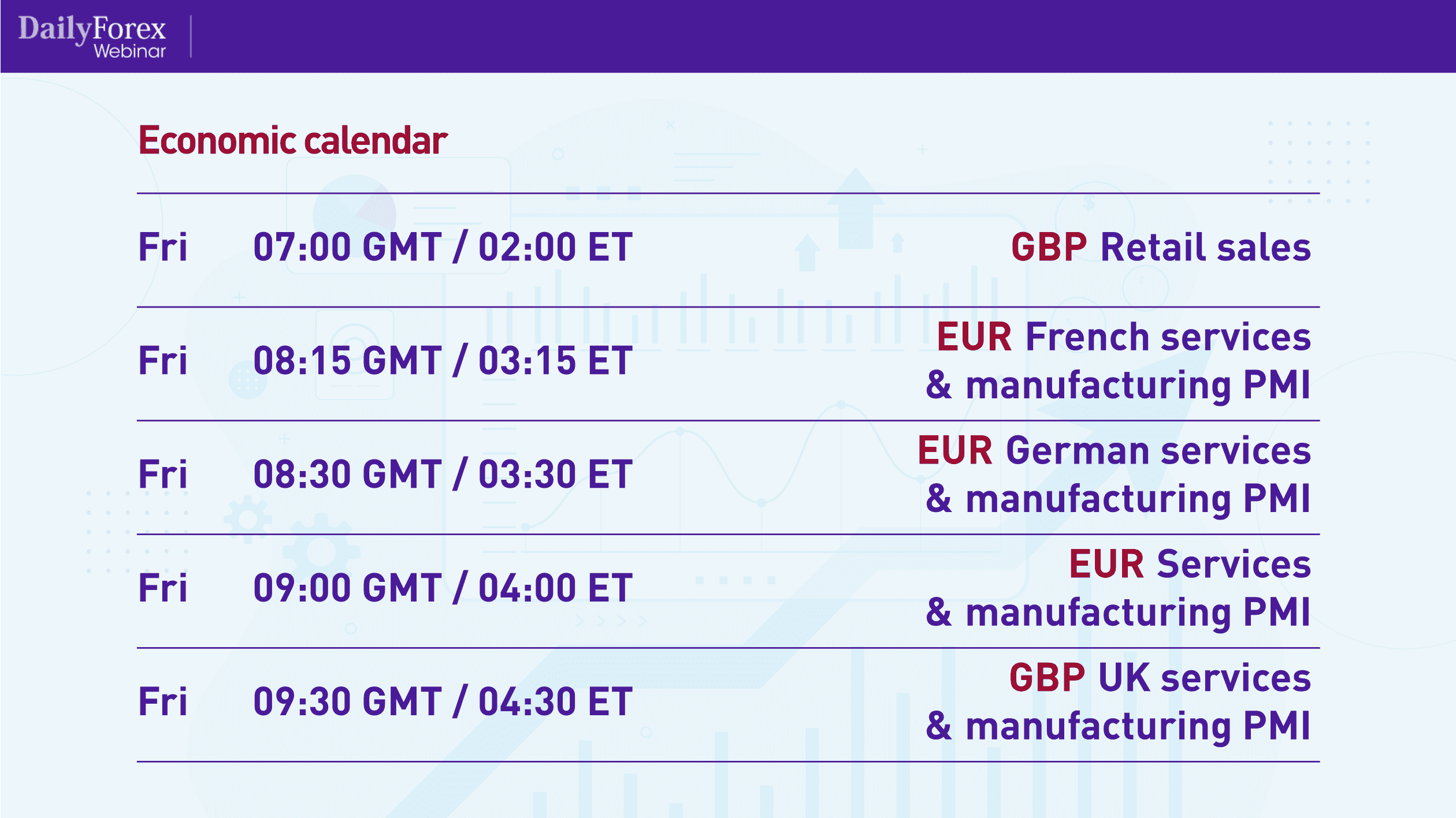
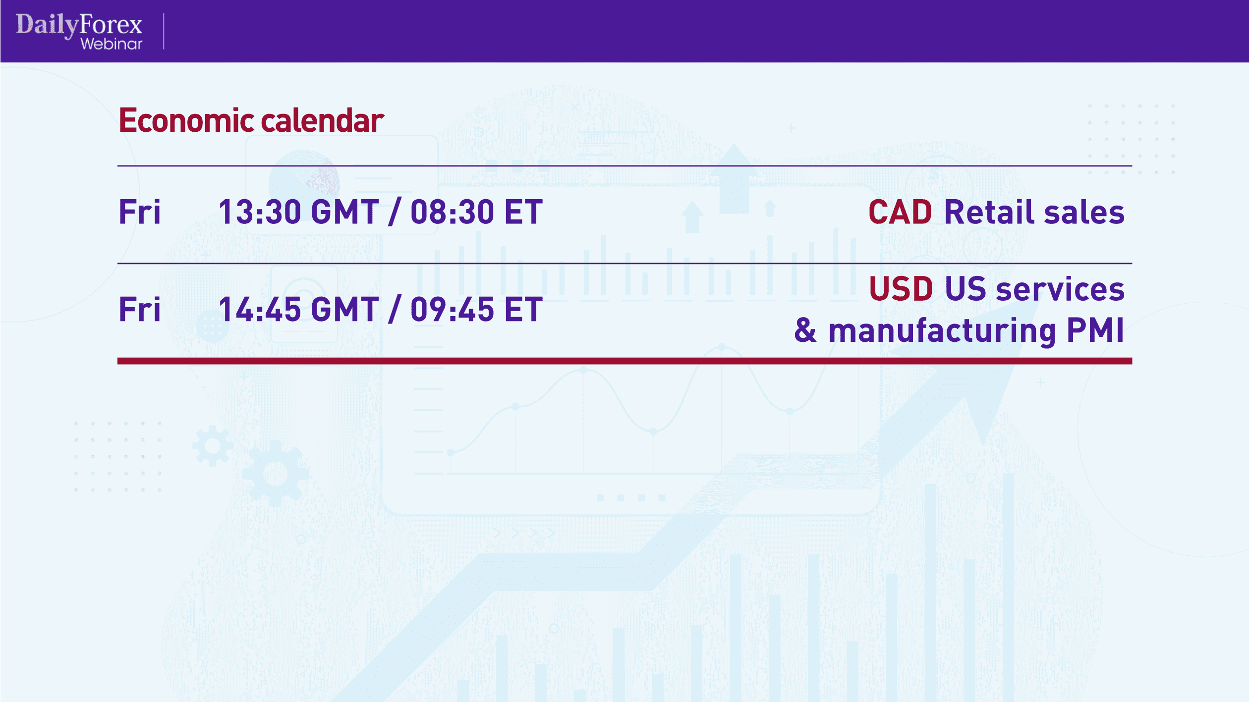
To that end, let's first look at the economic calendar, and then analyze the charts of some major pairs:
As you can see, it's a fairly eventful week, with a plethora of events that will be affecting major currencies and pairs. Keep in mind that Joe Biden will also be inaugurated this week, and markets will be watching his administration closely, moving based on its actions. As the saying goes: when the US sneezes, the world catches a cold.
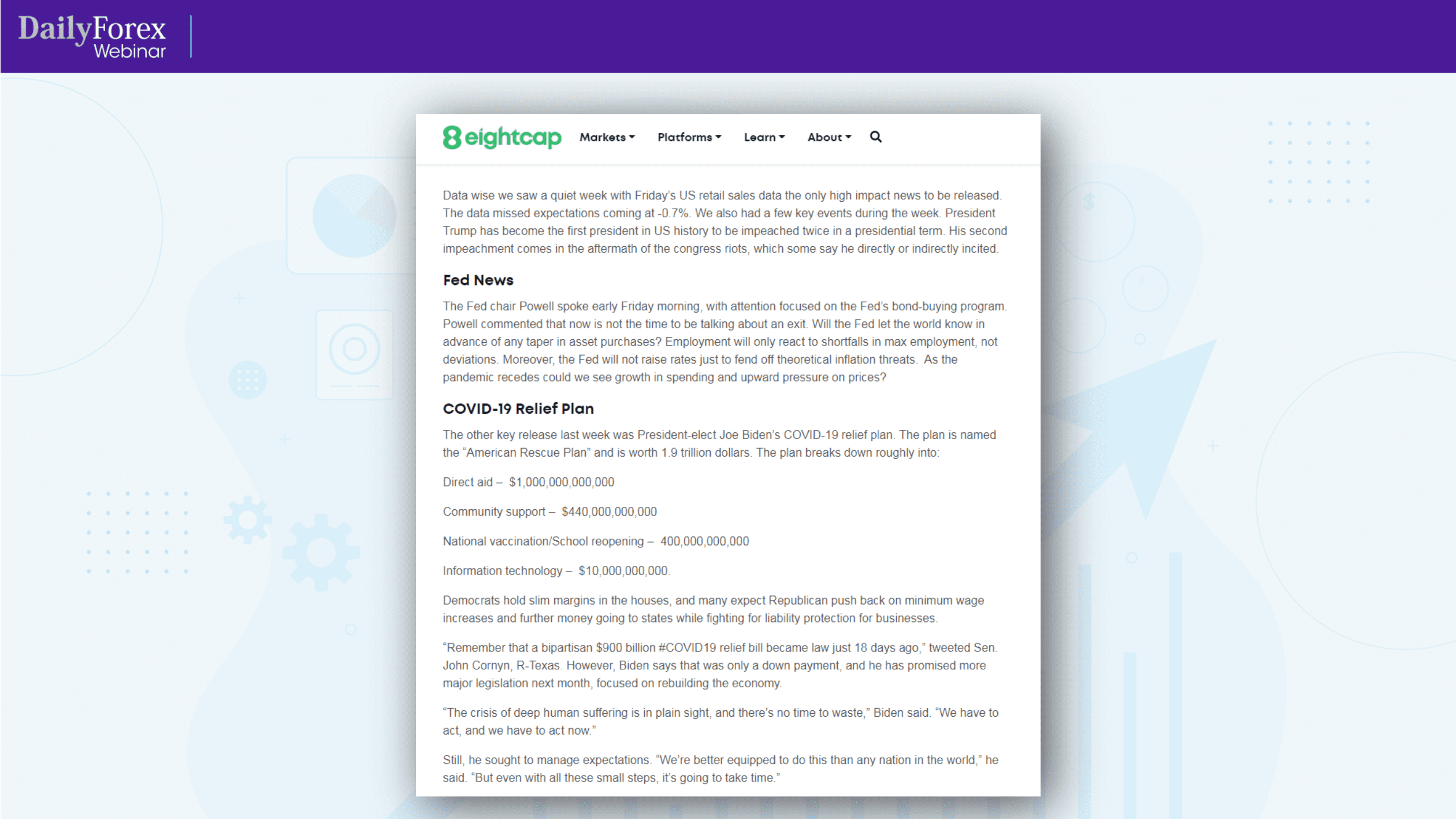
If you want a great resource for market reviews and analyses, I recommend EightCap.com.
If you visit the site, you'll see a “Learn” tab, which will lead you to the “Analysis Overview” tab.
The analyses are fairly short – I read them in about 5-7 minutes – and they give you a bit more context about what's happening in the markets. EightCap's market analyst, Joseph Jeffries, publishes a new analysis every week, which looks something like this:
For my technical analyses, I use longer-term charts, such as the weekly, daily and four-hour timeframes. However, for my executions, I use short-term charts such as the one-hour, 15-minute and, occasionally, five-minute timeframes.
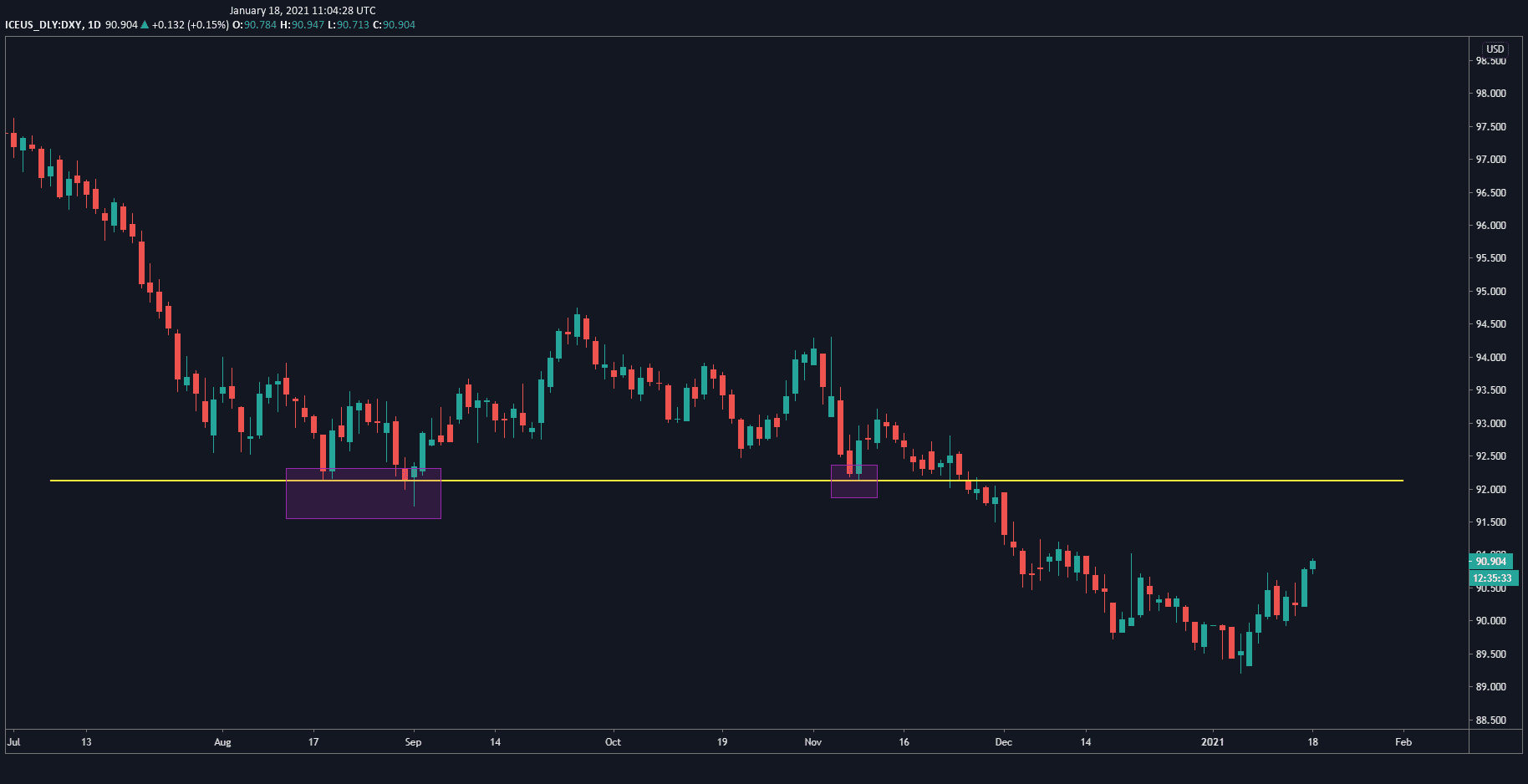
Let's now analyze some charts, beginning with the US Dollar Index daily chart:
You can see how the index was in a downtrend over 2020. The purple rectangles show how it bounced twice off the yellow support line and finally broke through it, going into that downtrend. Now, it's starting to gradually pick up, and I think it will test the support level as resistance, so I'm bullish the USD.
I also think there will be a sustained move upward because I can see strong daily candles, not just counter-moves.
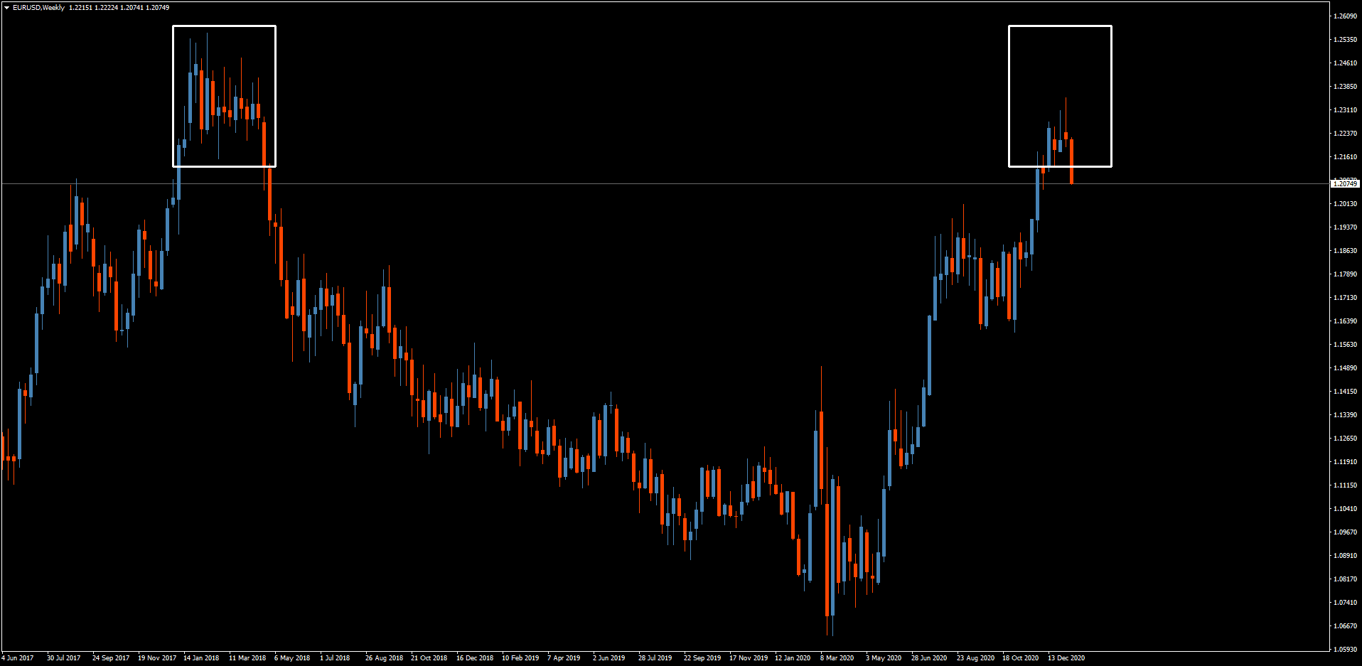
Now looking at the weekly chart for the EUR/USD pair, you will see the area of resistance the pair hit in 2017-2018, marked by the white rectangle on the left:
Clearly, the pair moved swiftly down and then came up right to the middle of that resistance zone, marked by the triangle on the right. It rejected it quite decisively with a large, weekly pin-bar candle, which tells me that sentiment has shifted. I think we'll see a bit of a retrace in the euro over the next few weeks.
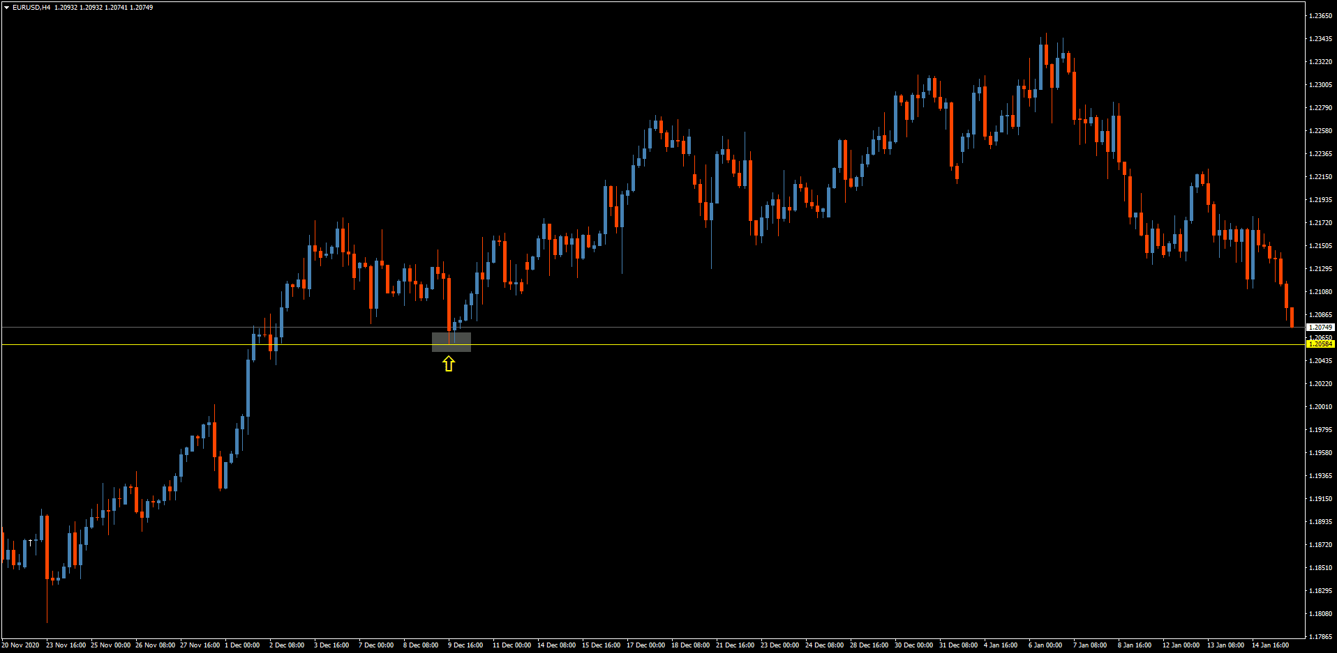
Let's zoom in to the four-hour chart for the EUR/USD:
You'll see how it's just made an impulse move downwards, meaning that there are consecutive long candles in a downward direction. I would recommend only going short once it breaks through the yellow resistance line.
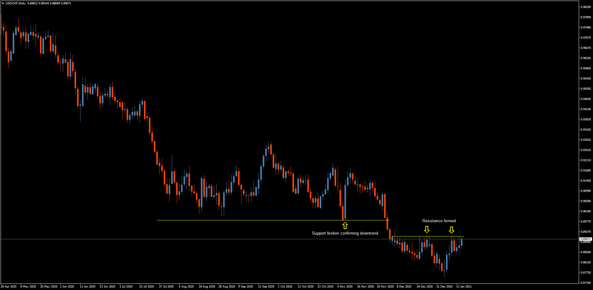
Moving on to the USD/CHF, which I'm bearish both in the long term and the short term, the daily chart shows us how it broke through the support level, never touching it again, thereby confirming a downtrend:
The pair formed a resistance, as you can see by the touches it made, marked by the arrows. So there are some low-risk opportunities on the bearish side with the USD/CHF pair (but make sure to manage your risk and always use stop losses).
The USD/JPY is also in a downtrend, as evident on the daily chart:
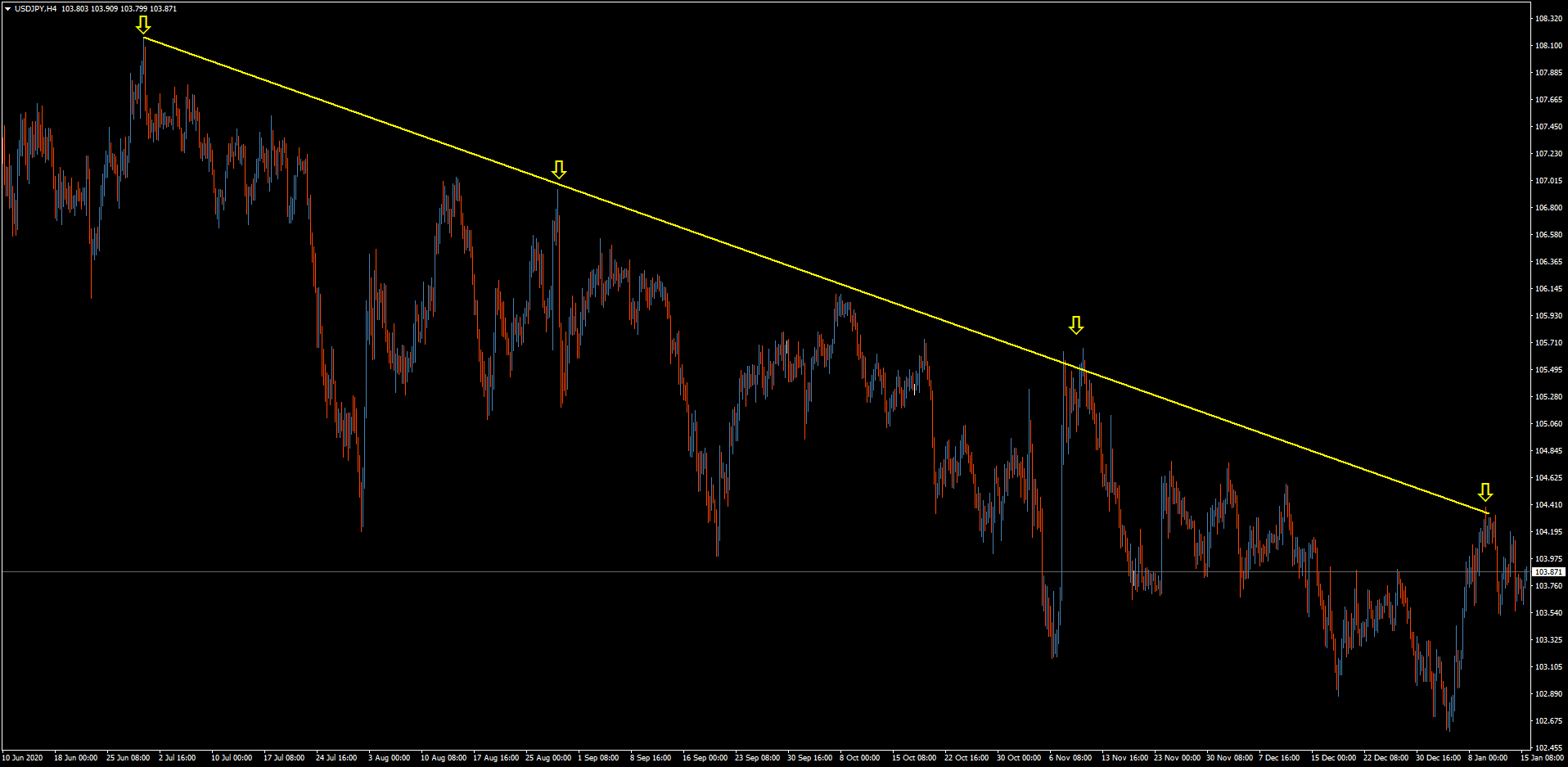
The four-hour chart shows how it's quite a volatile and “messy” downtrend:
Though I'm bearish the USD/JPY, I don't see many trading opportunities here because of the volatility. I would much prefer to see a horizontal support or resistance line in order to make a decisive trade.
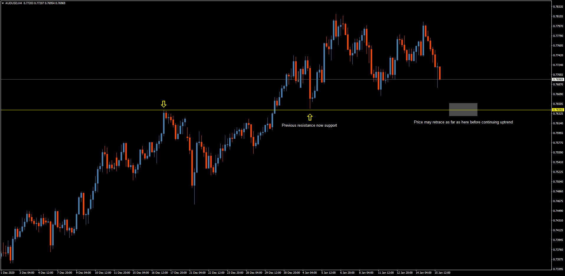
The AUD/USD, however, is in an uptrend, so needless to say, I'm bullish the pair:
The pair broke the resistance level and then tested it as support. It's tapering off, and I think it will test the support again in the area marked by the gray triangle before it continues its uptrend, and that's where you may want to get a position in.
I'm bearish the NZD/USD, which you can probably understand from the four-hour chart:
I've marked the yellow support line there because there's a big candle that bounced right off it, and the pair then touched the level again. It then broke through the support and is now heading down, so I would recommend going bearish the NZD/USD, placing stop losses where I've marked the small gray rectangle.
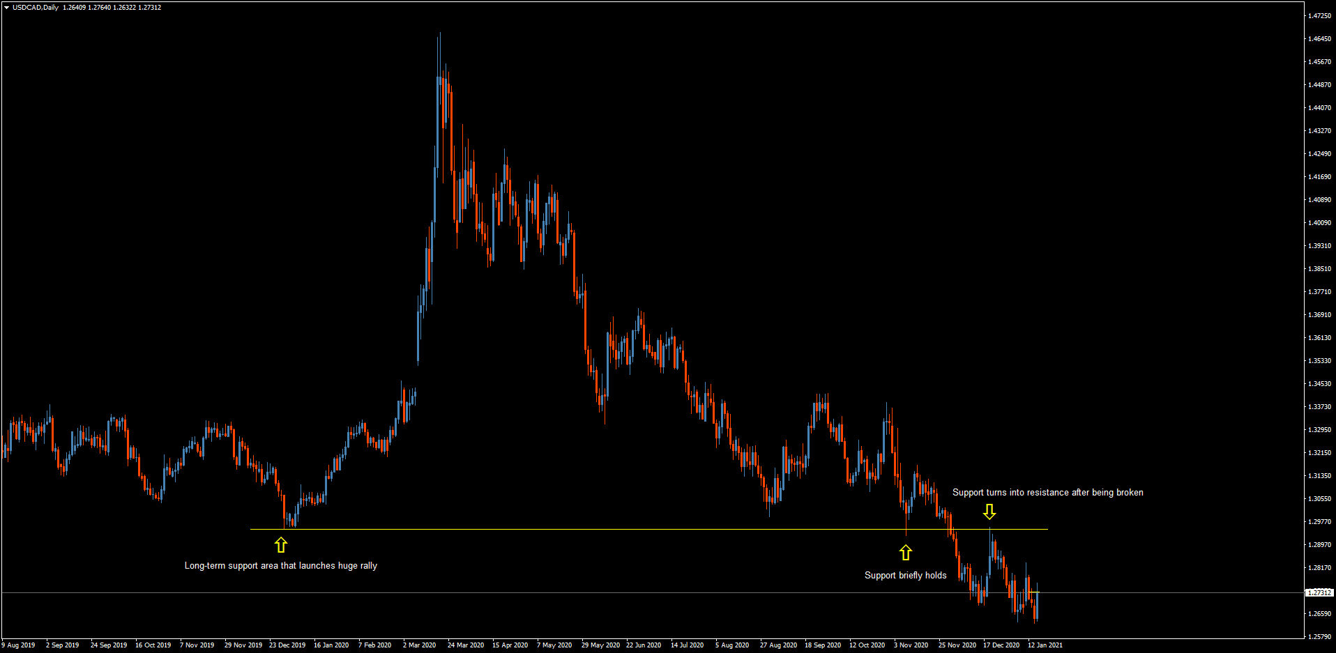
Let's now look at the daily chart for the USD/CAD, to give you some overall context for the pair:
There's a “launchpad” area there marked by the first arrow, from where the price shot up. It then had a big run up, then rebounded and compressed before moving down to test that same support level, marked by the second arrow. The pair then broke through that level and tested it as support, as marked by the third arrow, so I'm bearish the USD/CAD.
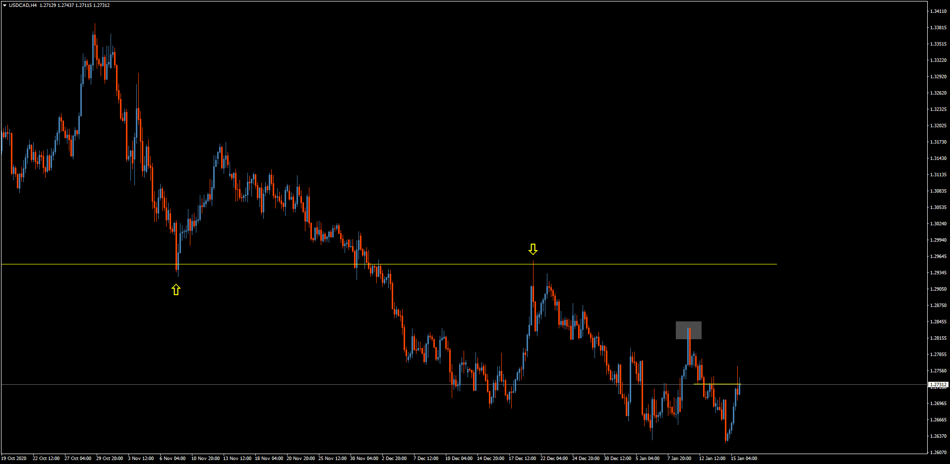
On the four-hour chart, I've put a gray rectangle where the pair rejected that level:
I wouldn't say this is the cleanest of trades, mainly because the stops are so wide, so I would struggle to find a good stop loss. But overall, I'm bearish this pair.
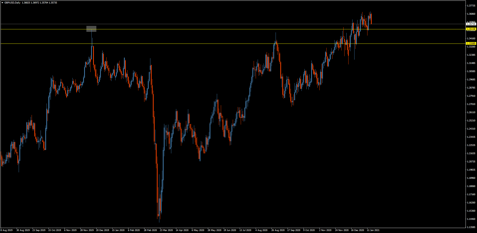
Lastly, let's look at the GBP/USD pair, beginning with the daily chart:
I've marked two yellow lines, which are levels that I think are important. The pair touched the upper resistance level and snapped back twice, seemingly averse to closing above the lower level. It would really need to sit above that lower level in order to be a bullish pair.
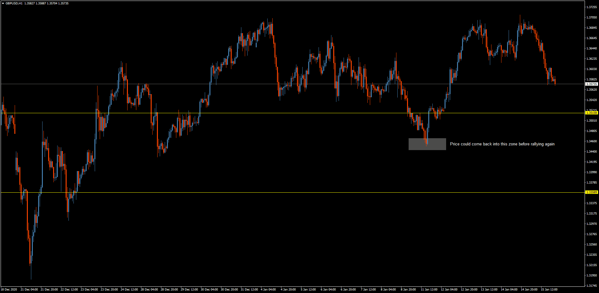
In the short term, I think it will come down and tap the area I've marked by the gray rectangle on the hourly chart:
You can clearly see how the GBP/USD is being quite bearish by making such a strong impulse move downwards. It will likely continue to be bearish for the next couple of weeks, and there are trades there to be made. However, in the long term, I think it's a bullish pair.
Some final thoughts:
If the chart isn't clear, stay away from it. Either find a different chart or a different pair.
Also, as I mentioned before, always mind your risk and set stop losses.

