When conducting a market analysis – and trading in general – you will find that there are two main methods: one is to use a fundamental analysis, basing your trades on the latest news that might affect the market, such as interest rates, CPIs, etc. The other method, of which I am a proponent, is to use a technical analysis, which involves basing your trades primarily on price charts and price action.
I do, however, look at economic calendars, which can give you a grasp as to where the market is heading. A great place to find economic calendars for trading is at Exness.com. A smart feature of their calendars is that they come with a currency filter, so you can isolate the pairs you want.
Let's look at the economic calendar for the next week:
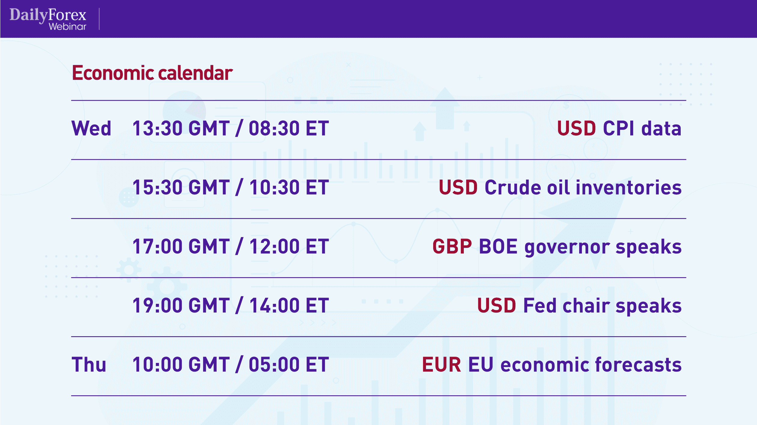
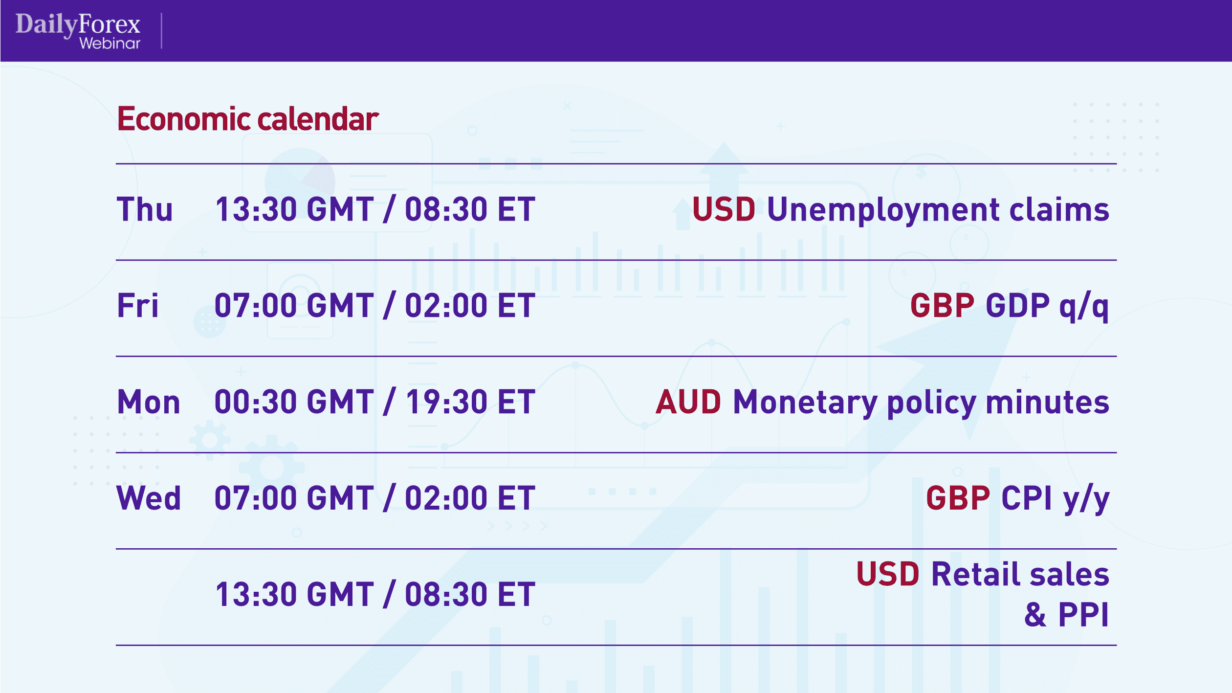
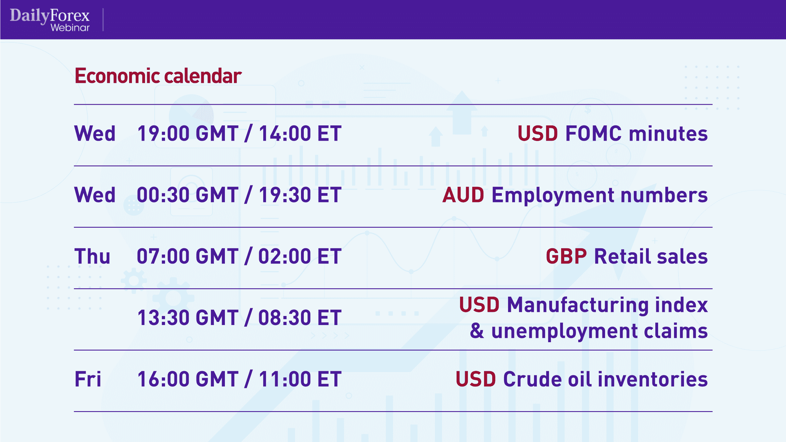
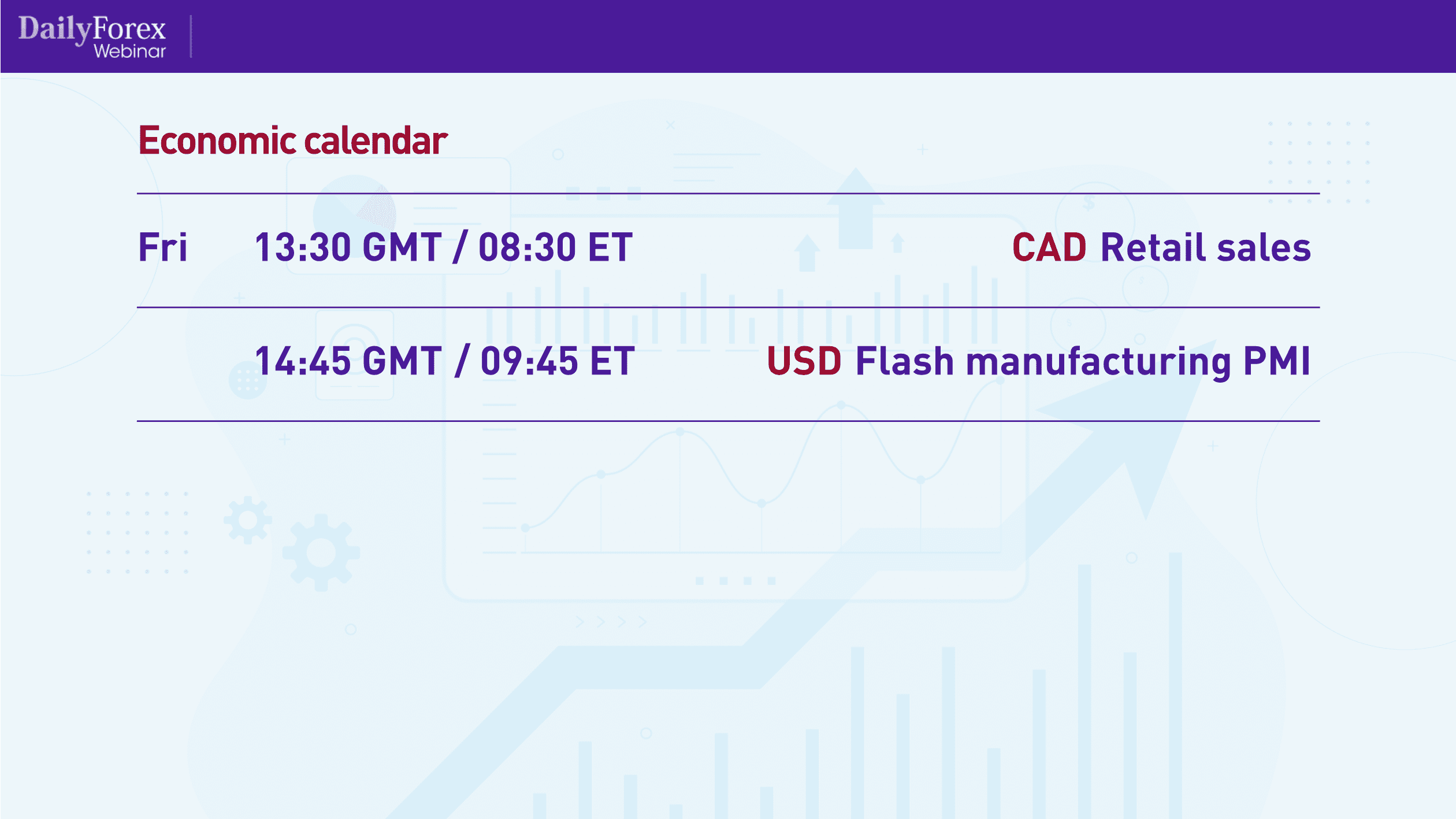
As you can see, it's going to be pretty busy towards the end of next week, and it is likely that the major currency pairs will move, especially when interacting with such things as the FOMC minutes.
After looking at the economic calendar, I then move on to looking at price charts. I typically start with the US Dollar Index (DXY), so I can see where the US dollar is headed and plan my trades around that. Here is the DXY's daily chart, going back to March 2020:
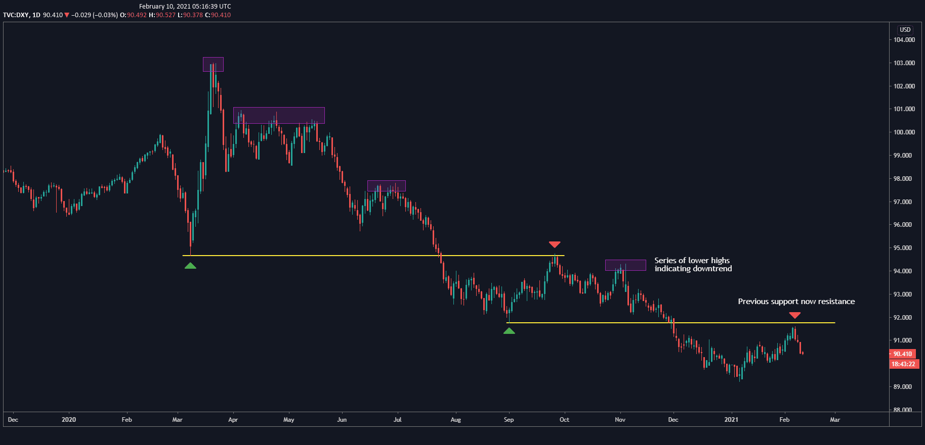
The chart shows how the DXY rose rapidly during March, which is when the threat of COVID-19 became apparent. At that time, many of the indices were experiencing a lot of liquidity. The USD then dropped to form a support level, marked by the upper yellow line, eventually breaking through and coming back up to test that same level as resistance in what we call a “role reversal”. Using role reversals – which can be either when support becomes resistance or vice-versa – is a great trading mechanism to use to enter trades.
The DXY did the same thing with the lower support level marked by the lower yellow line, now testing that support level as resistance, which is why I'm bearish the DXY and thus bearish the USD in most of my trades. It's actually in a textbook downtrend, as you can see by the lower highs, marked by the purple triangles.
In general, I like to use the higher timeframes, such as the weekly or daily charts, for my analysis. Then, I move to the lower timeframes, such as the four-hour, hourly, 15-minute or 5-minute charts, for the actual execution of the trade.
Now that we've seen the DXY, let's take a look at the daily chart for the EUR/USD, going back to April 2020:
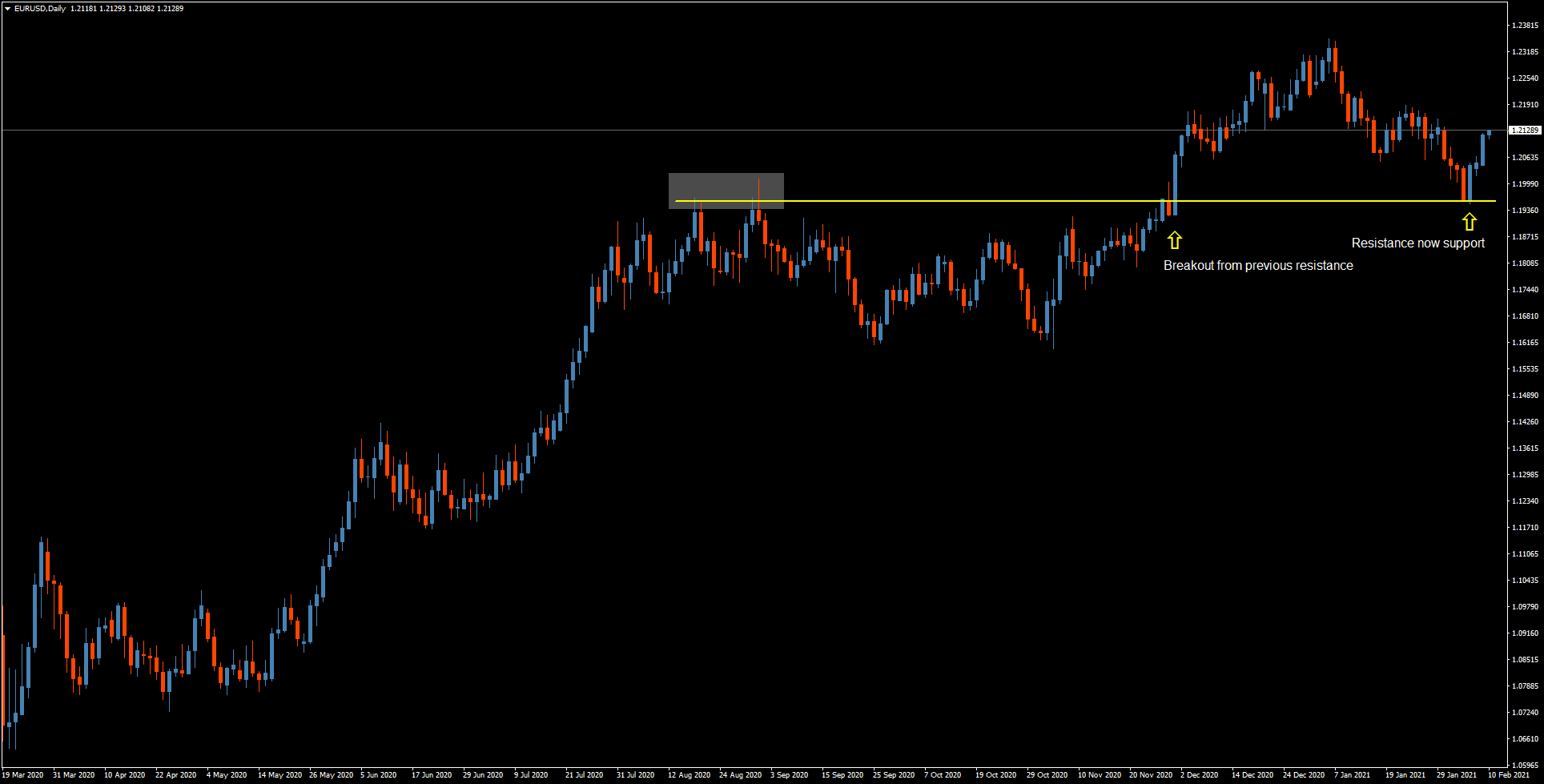
The pair made a resistance level marked by the yellow line, and broke through it where you see the long, decisive, daily candlestick. However, it didn't keep that momentum, so it moved back down and tested the resistance level as support, so I'm now bullish the EUR/USD.
It's important to note that where it tested the level as support, you see a bearish candle with short wicks, followed immediately by a bullish candle, also with short wicks. That means that there was a decisive downward movement followed by a complete change in sentiment and a decisive upward movement.
Let's now look at the daily chart for the USD/JPY pair, which I find quite interesting:
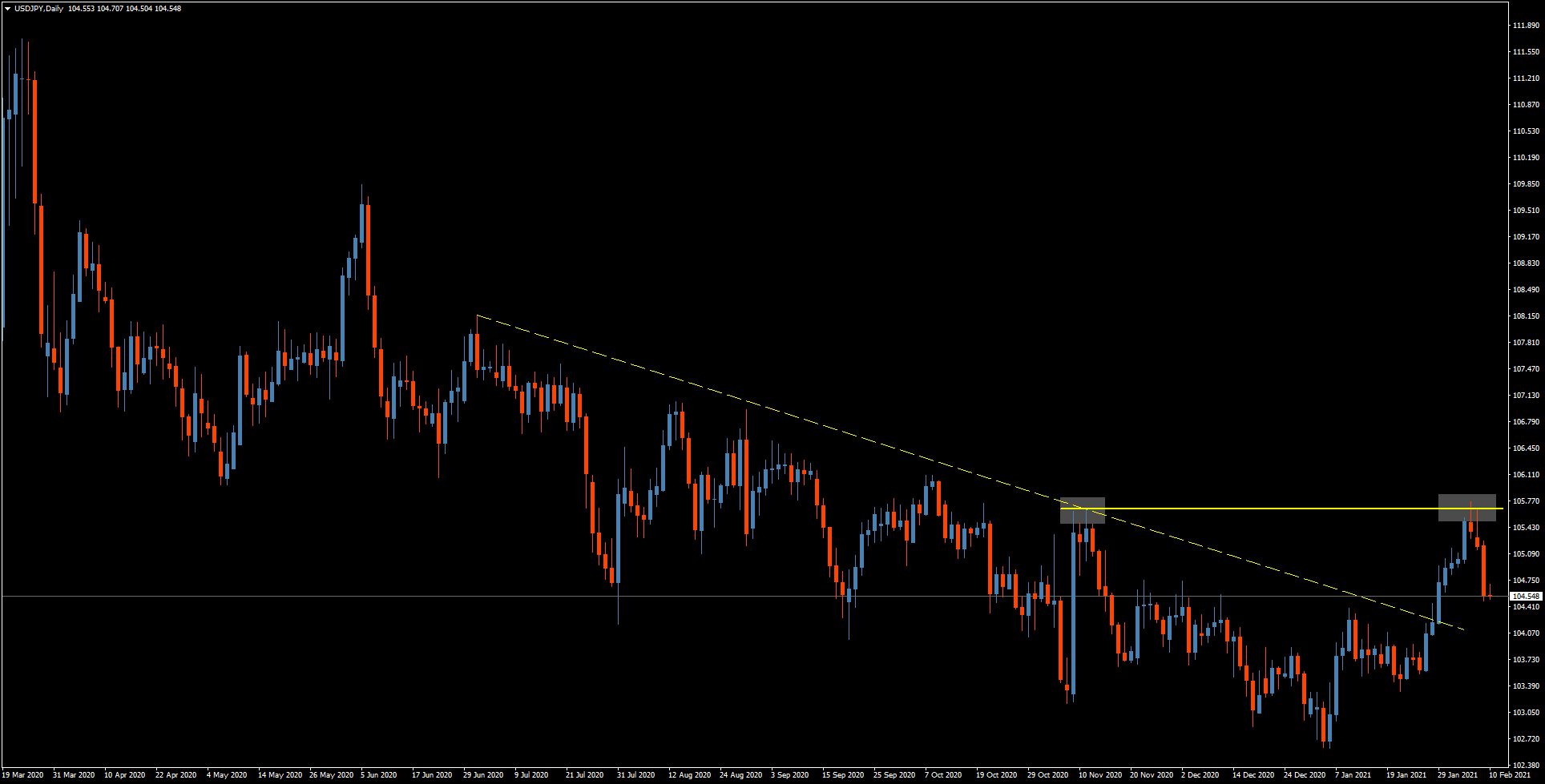
I've marked the downtrend with a solid yellow line. It was a pretty volatile downtrend with large, wide pullbacks, which means it's not the cleanest trade to get into. But it did break through that trend line, marked by the grey square, and then broke through it again with a big, impulsive move, reaching to the same level as marked by the second grey square. That's where it stalled, and then moved swiftly back down, so I'm bearish the USD/JPY. However, I wouldn't jump in with a trade at this point. I would wait for a narrow pullback, and enter the trade when it starts to move back down.
Remember: just because a trend line was broken does not mean there will be a trend reversal. It simply means that that segment of the trend has been broken.
The daily chart for USD/CHF also shows us an interesting trade:
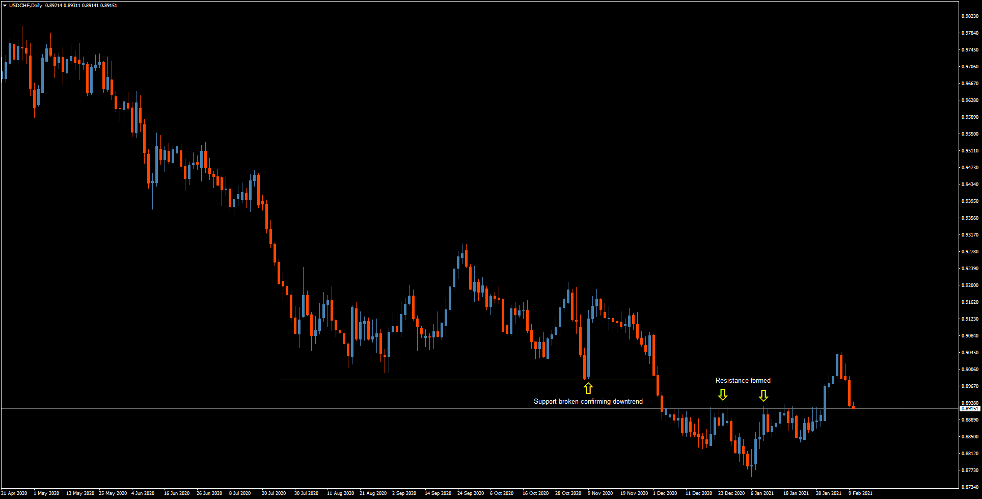
There's a clear downtrend here that broke the support level marked by the upper yellow line. Then, the pair formed a resistance level, which it broke through and then came back down to sit at that level. So the question here is: is this a true reversal?
My bias is always toward the bigger trend, so my hunch is that the USD/CHF's downtrend will continue, and not bounce off this resistance. In fact, if you were to zoom in to the four-hour chart, you would see that the recent move downward is quite strong and quick, signified by long red candles and impulsive moves. I'm therefore bearish the USD/CHF.
Although I don't think there are any great trading opportunities in the USD/CAD right now, I think it's useful to look at from a technical analysis point of view, using the daily chart:
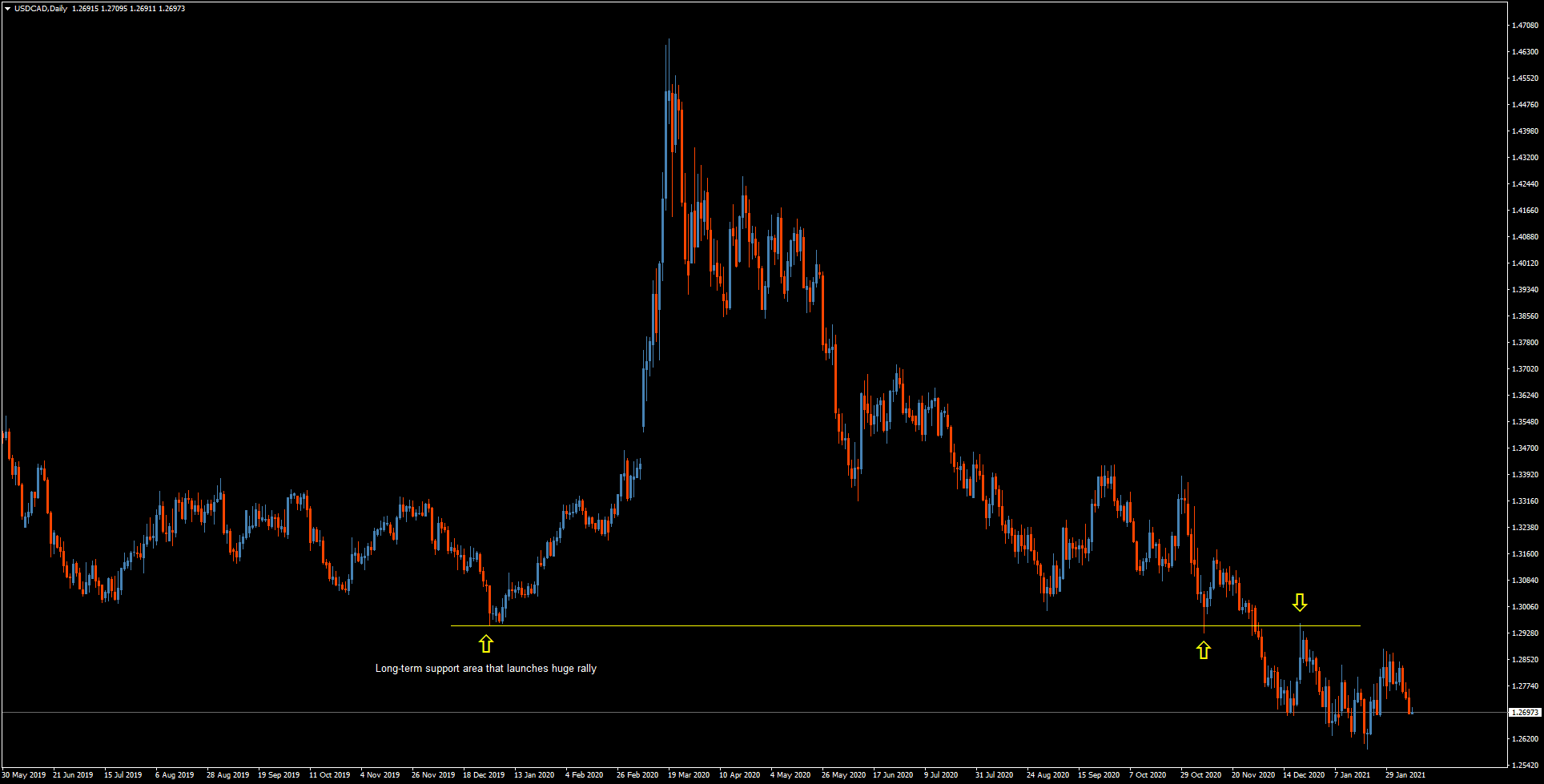
The long-term support has clearly been broken through, then was cleanly tested as resistance. The downtrend is marked by progressively lower highs, and I think the chart is showing that it will continue. Therefore, I'm bearish the USD/CAD.
In my opinion, the GBP/USD pair is an excellent one to trade right now:

The pair touched, then broke through, the resistance level, continuing its uptrend, so I'm bullish the GBP/USD.
The AUD/USD shows a nice, clean uptrend:
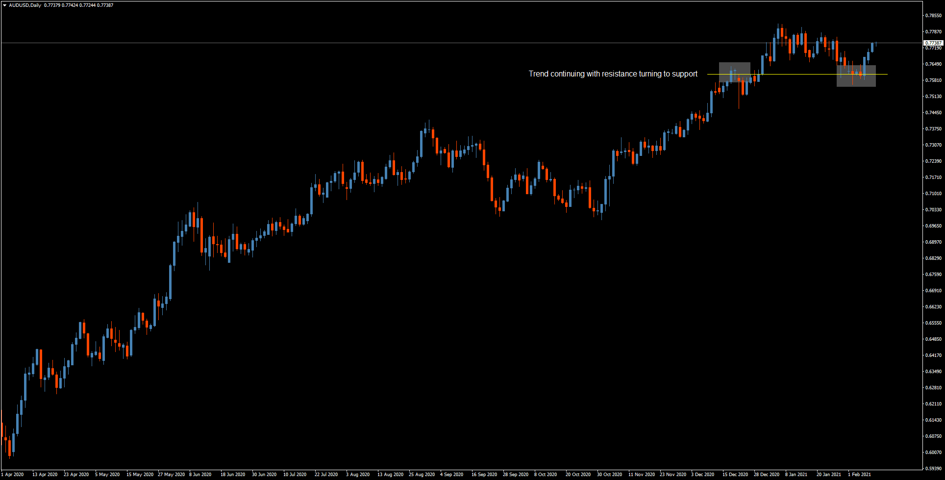
You can see where the pair also broke through resistance and came back down to test it as support, which is a counter-move. I think it will rocket back up, so I'm bullish the AUD/USD.
The NZD/USD is a similar scenario:
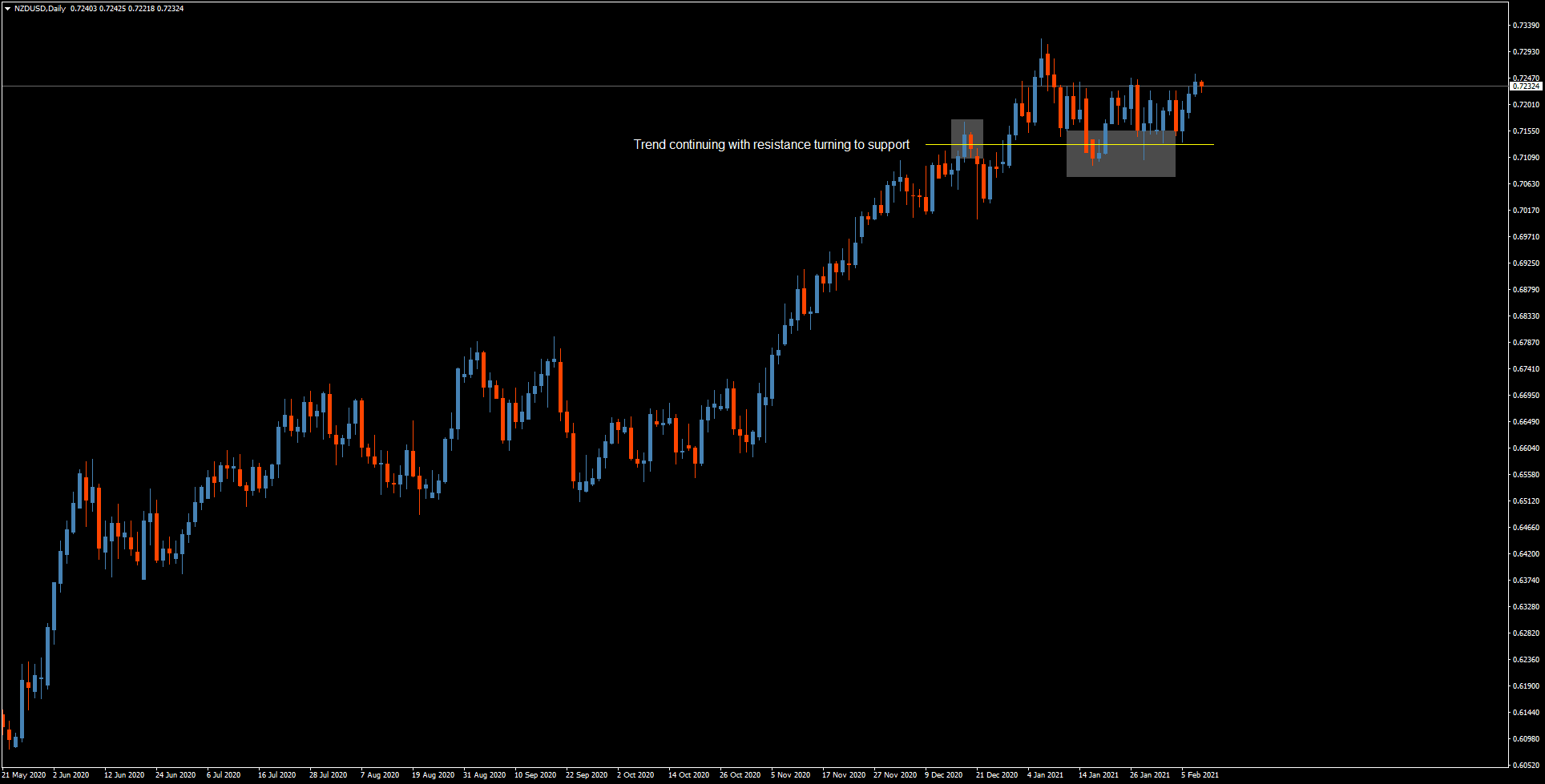
Here, too, there is a clean, non-volatile uptrend, where it tested the resistance level as support twice, and I'm of course bullish the NZD/USD.
I'll leave you with some final notes:
If a chart is unclear to you, stay away. Better to trade a different pair than to trade based on a chart you cannot accurately see.
Finally, make sure to manage your risk as much as possible. Use stop losses with good ratios, and don't place too much of your account on a single trade.
