When conducting any market analysis, it's a great idea to begin with looking at the economic calendar for the week to gauge that market and where it might be headed.
If you're unfamiliar with an economic calendar, it looks something like this:
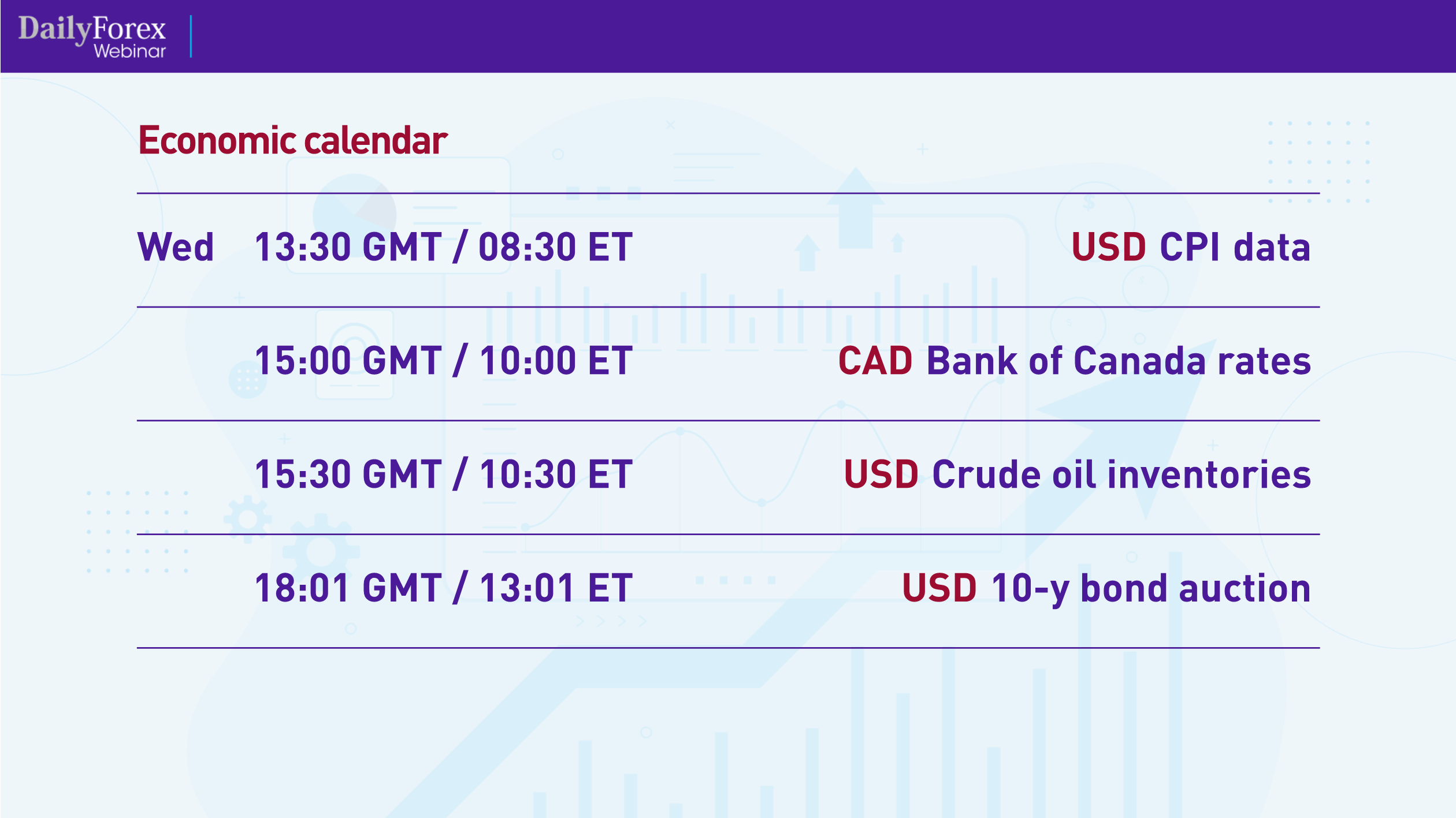
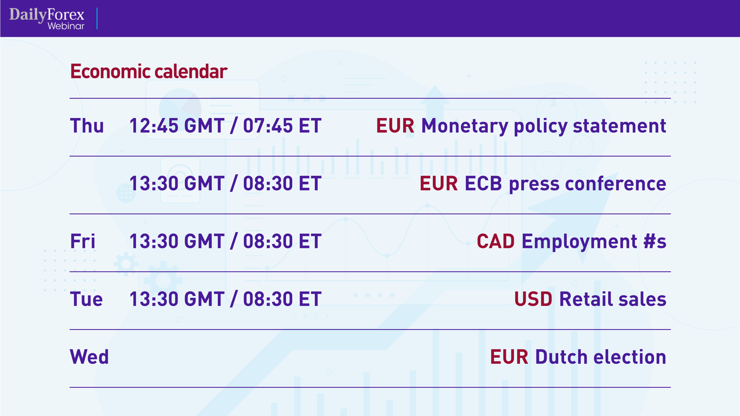
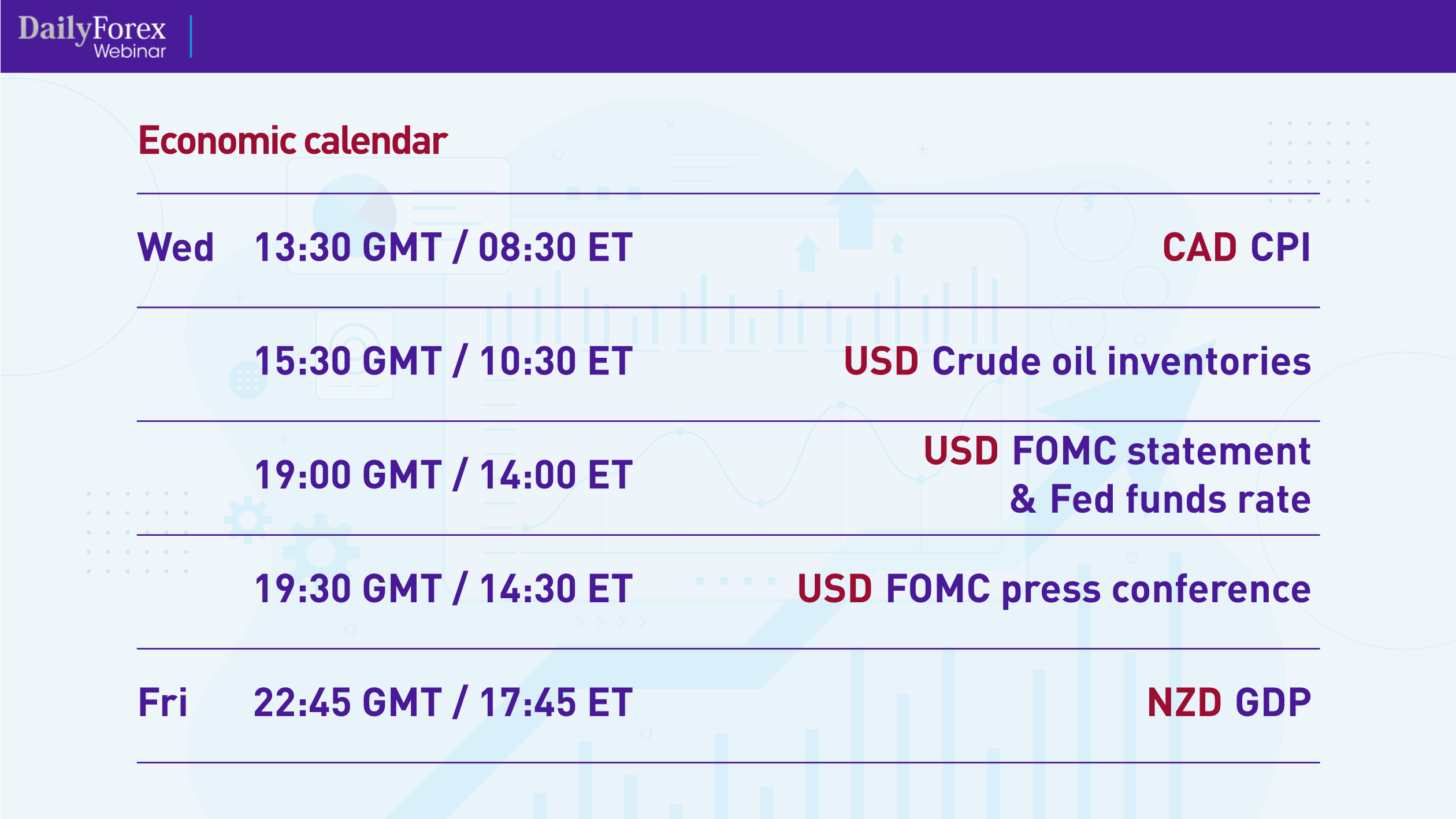
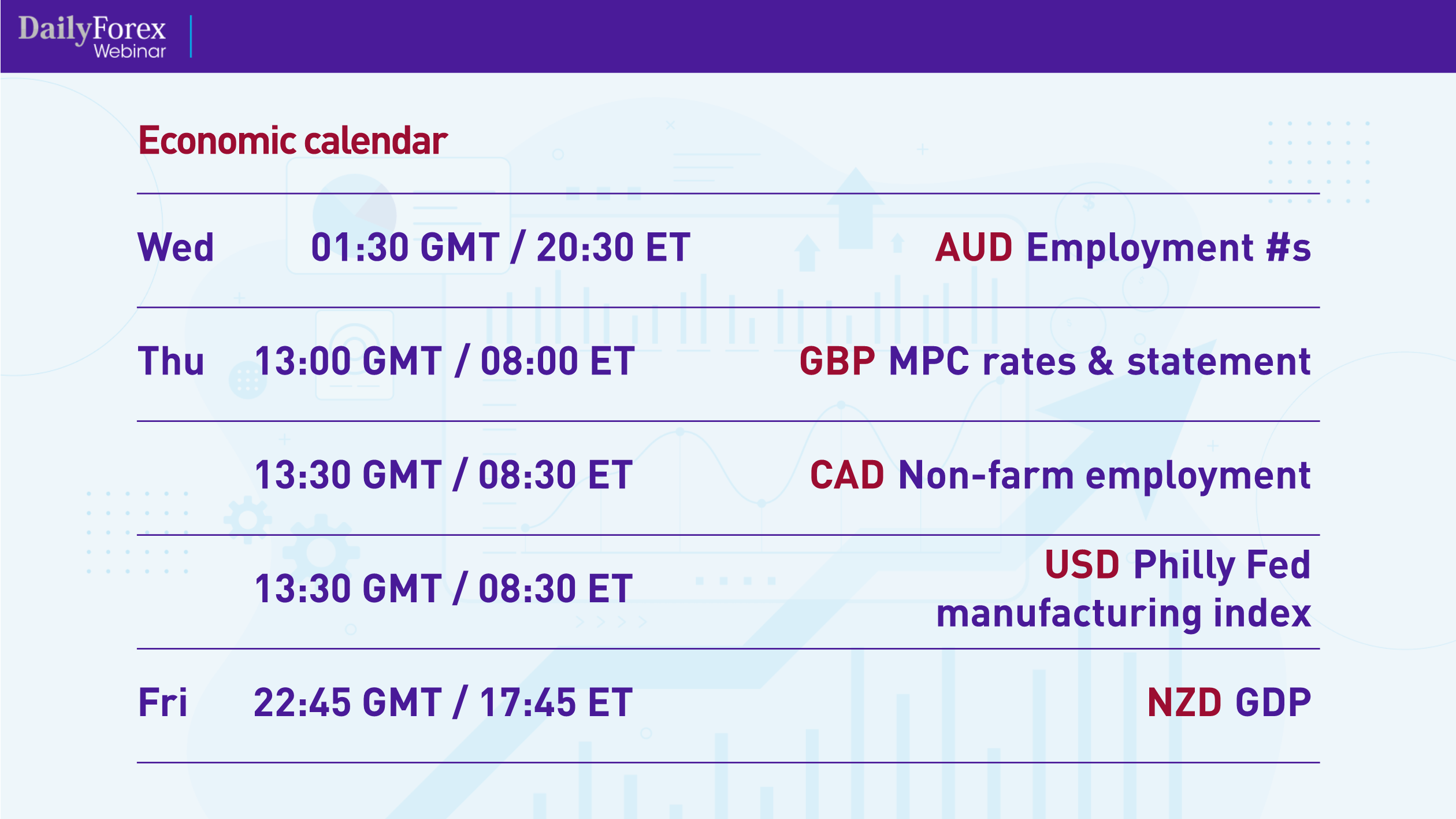

These are all medium- to high-impact news items expected this week and next, which will affect the major pairs.
A great place to find economic calendars is FXTM, which gives you free access to their calendars. FXTM also offers free signals, which show the top market strategy managers.
Before we look at actual price charts for the major pairs, I think it's worth explaining a bit about timeframes. I define “higher timeframes” as the weekly, daily and four-hour charts, and I define “lower timeframes” as the hourly, 15-minute and 5-minute charts. I use the higher timeframes to conduct my market analyses, and then I use the lower timeframes for the execution of the actual trade.
With that, let's begin with looking at the US Dollar Index (DXY) daily chart, which can give you a good frame of reference for the major pairs, such as whether to be bullish or bearish various pairs:
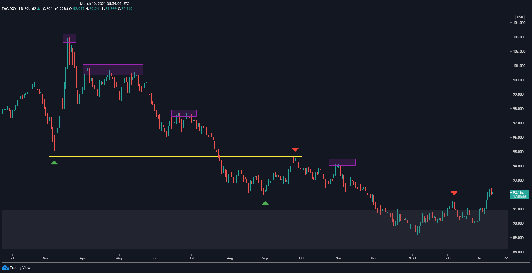
The US dollar hit a peak back in February 2020 and then fell into a downtrend, which eventually broke through previous resistance and came back to test it before breaking through a lower support level. At the right of the chart, you can see how the price tested that level as resistance. I actually thought it would resume its downtrend, but now it's broken through that resistance. I think this is a pullback happening, and the price will come down to test this resistance as support. I'm expecting the DXY – and therefore the US dollar – to turn bullish.
Now let's move to the major pairs, beginning with the weekly chart for the EUR/USD:
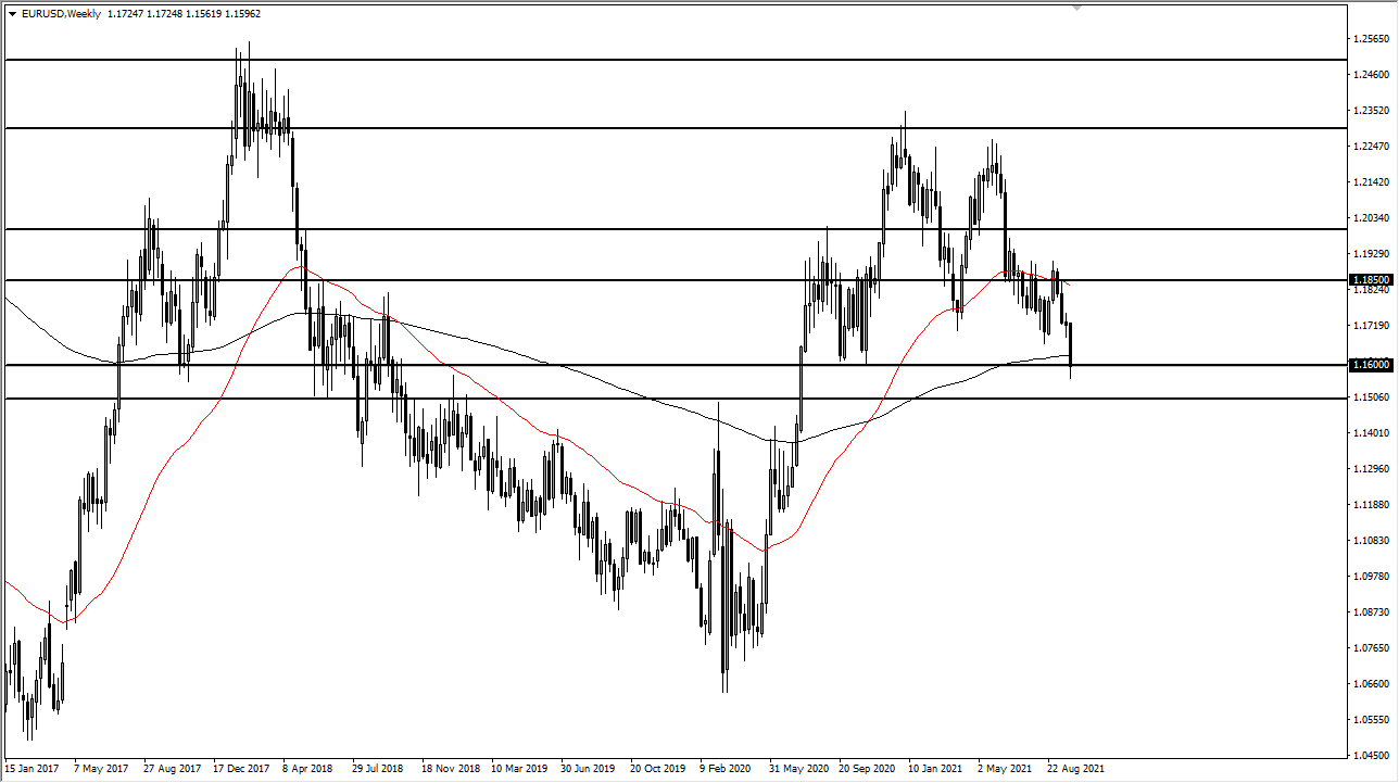
The EUR/USD has come back up to a level it had tested as resistance in 2017, just before it began the downtrend you see in the chart. It has reversed pretty strongly at that level with some very bearish candles, so I'm bearish the EUR/USD.
Let's also look at the EUR/USD's daily chart to confirm the outlook:
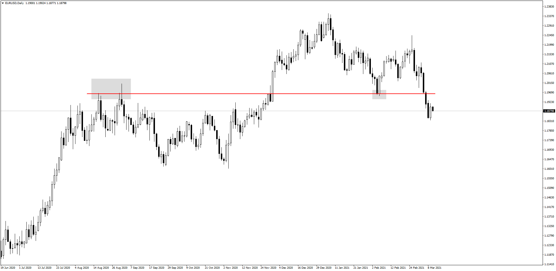
Here you see that the price broke through the marked resistance level at 1.1961 and came back down to test it as support. However, instead of moving back up, as I had expected, it has continued moving down. I believe it will test the support as resistance, so I confirm that I'm bearish this pair.
However, I recognize that testing the support as resistance would be a pretty deep pullback, as evident on the hourly chart:
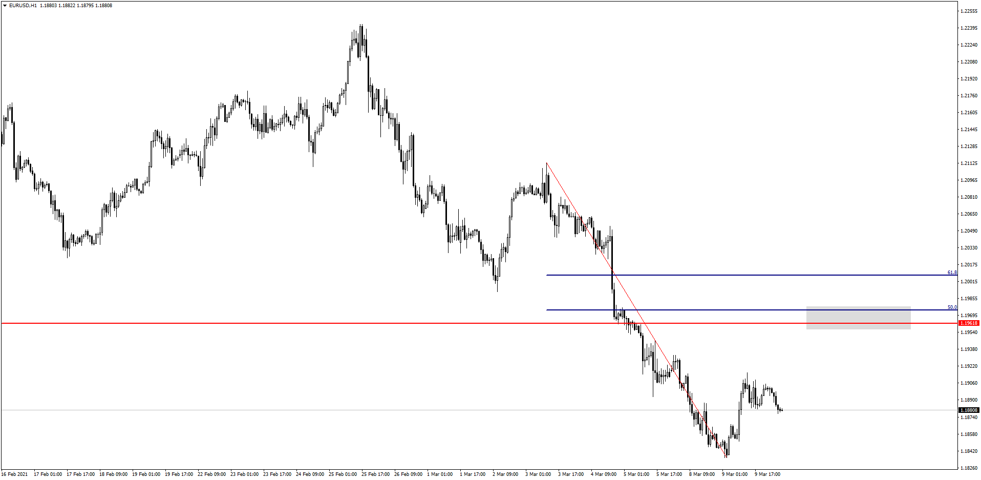
The price has about 60 pips to go until it hits that level, which would be the optimal point to get in the trade. It's likely that the price may not reach that high before it goes back down.
The GBP/USD is similar to the EUR/USD, which you can see on the weekly chart:
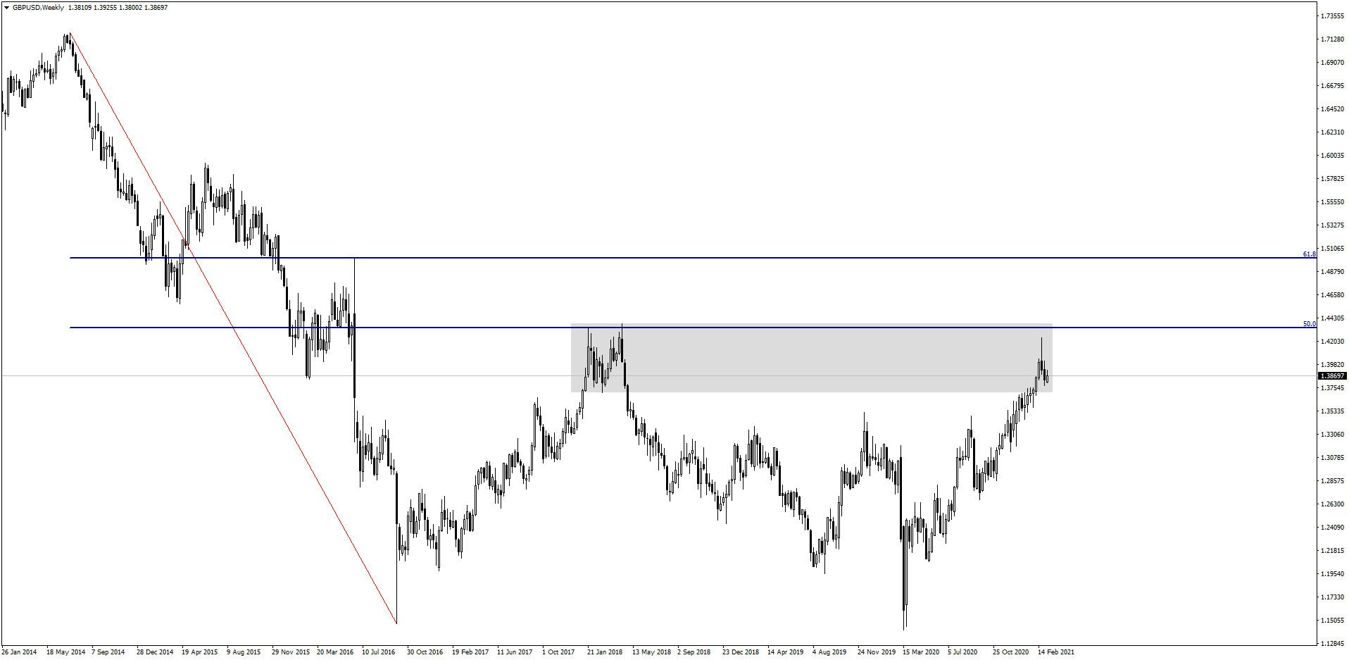
The price stalled before it reached the 50% Fibonacci level, which it then decisively rejected with a long candlestick.
In fact, looking at the 4-hour chart, the GBP/USD seems to be in a new downtrend, shown here by consecutively lower highs which I've marked with grey rectangles:
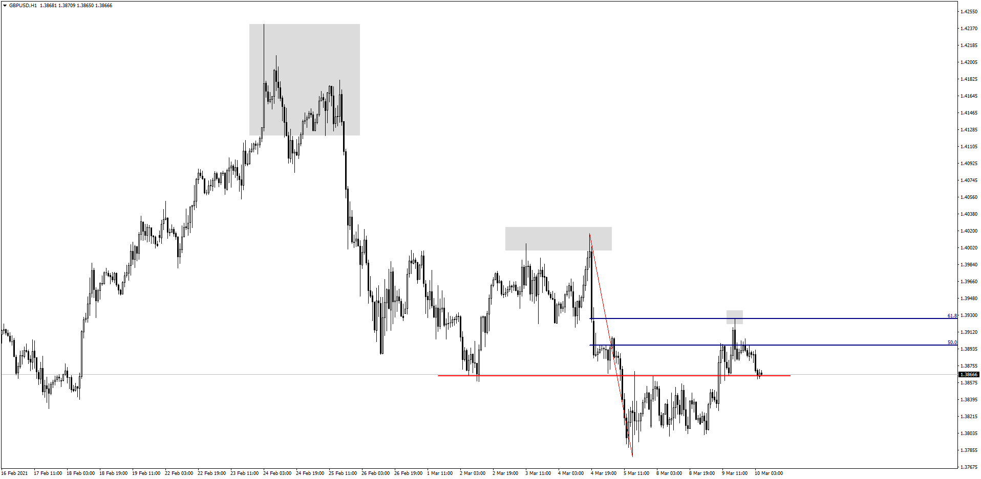
Given all this, I'm bearish the GBP/USD.
I'm also bearish the AUD/USD, looking at the hourly chart:
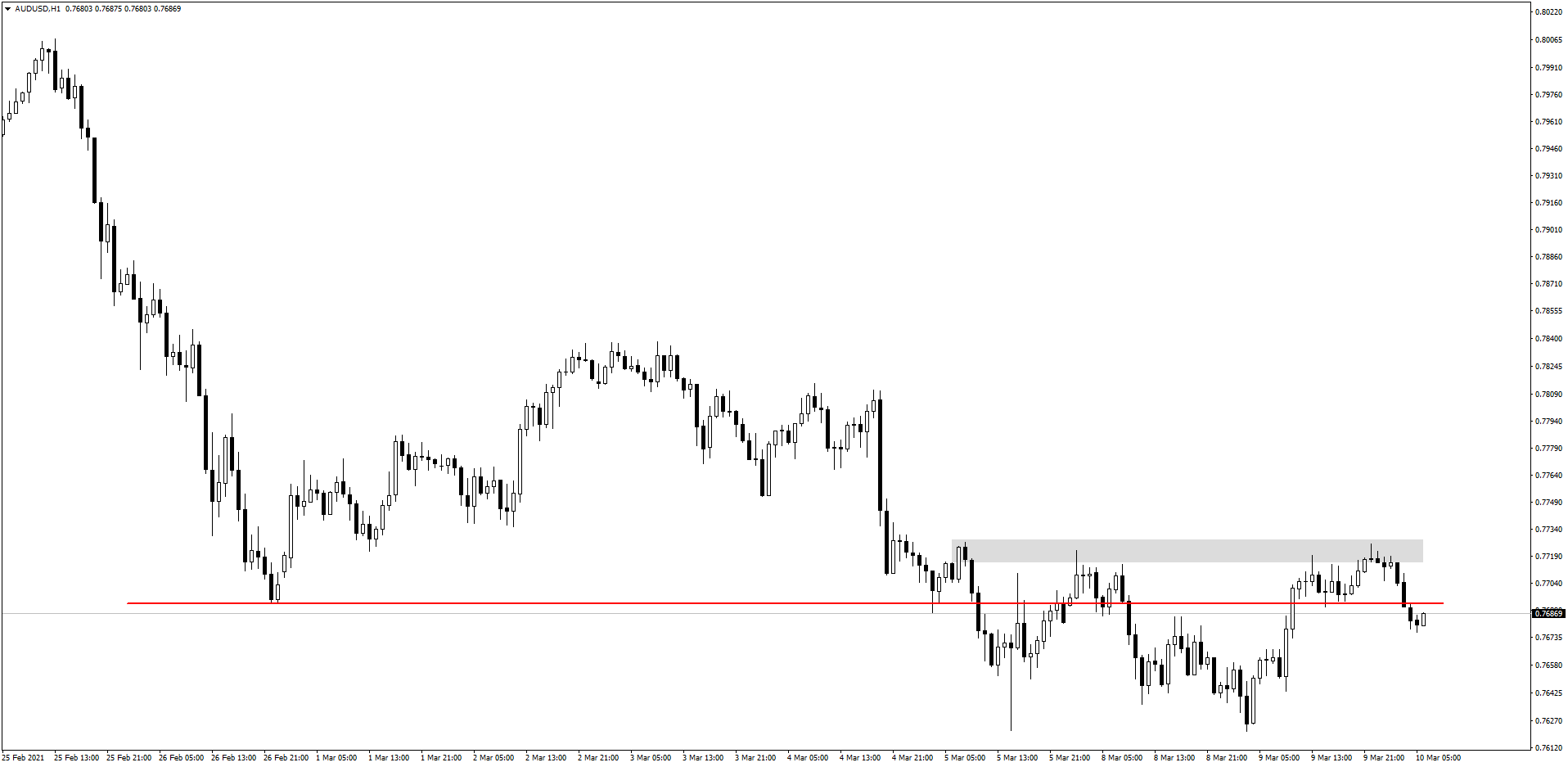
It's broken through the red support level, but I really want to see it break through the support level I've marked by the grey rectangle, which is around 150 pips away. At this point, I would move to the 15-minute chart to actually execute the trade.
The NZD/USD is very similar to the AUD/USD, but I think it offers a clearer picture on the daily chart:
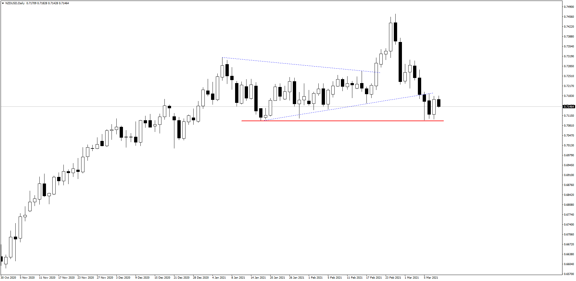
The price was trending up and then squeezed into a triangle before breaking out to the upside. Then, it swiftly came down with two very bearish rejection candles, covering around 240 pips. I'm waiting for it to break through the red support level, but I'm already bearish the AUD/USD. If you're confident in your bearish outlook for this pair, you can consider placing a short position if the price hits the 61.8% Fibonacci level at the top of the range.
Let's look at the chart for the USD/CHF:
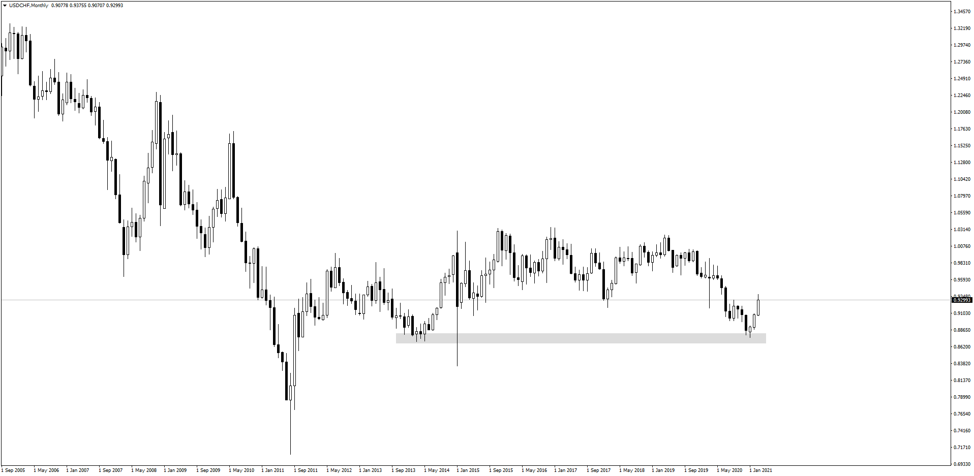
The USD/CHF is erratic in the best of times. It formed the grey support area in 2013/2014, which it re-tested more recently, at which point the bulls really stepped in and brought the price back up in the last couple of weeks.
The daily chart for the USD/CHF gives us a closer look as to where the pair is headed:
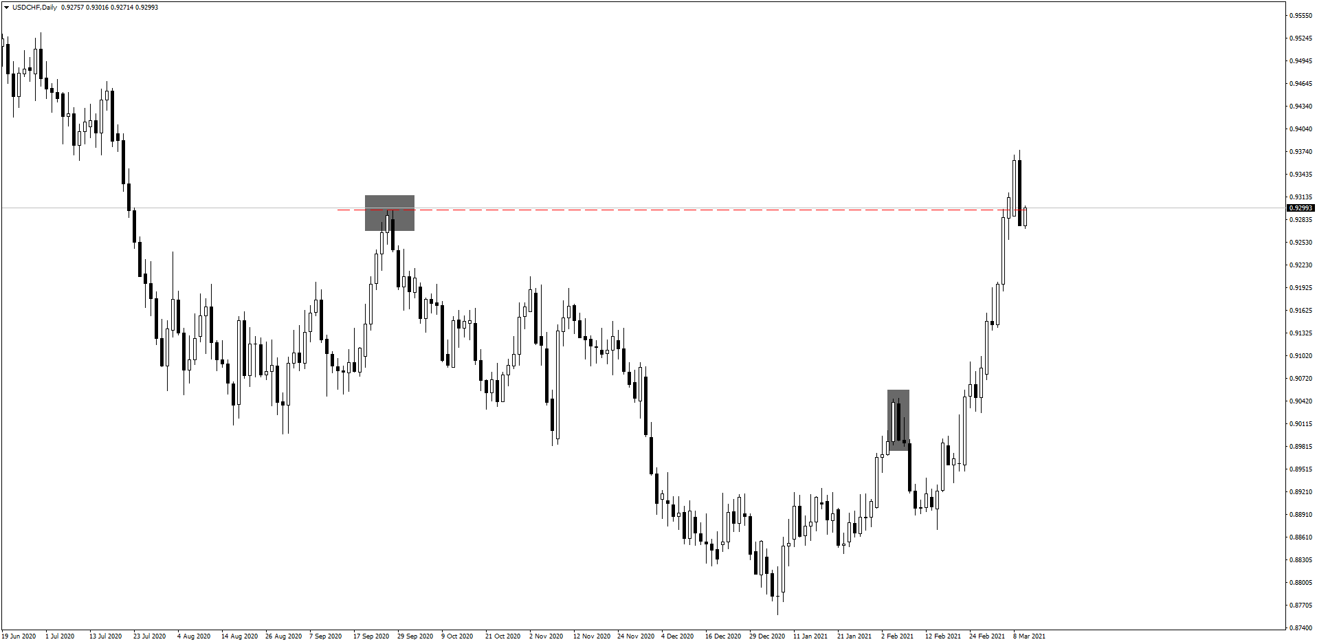
The price has clearly broken through the resistance, but it remains to be seen whether it will come back down or test the level as support. It looks like a strong reversal candle, which often means we can expect a pullback and then resume the trend.
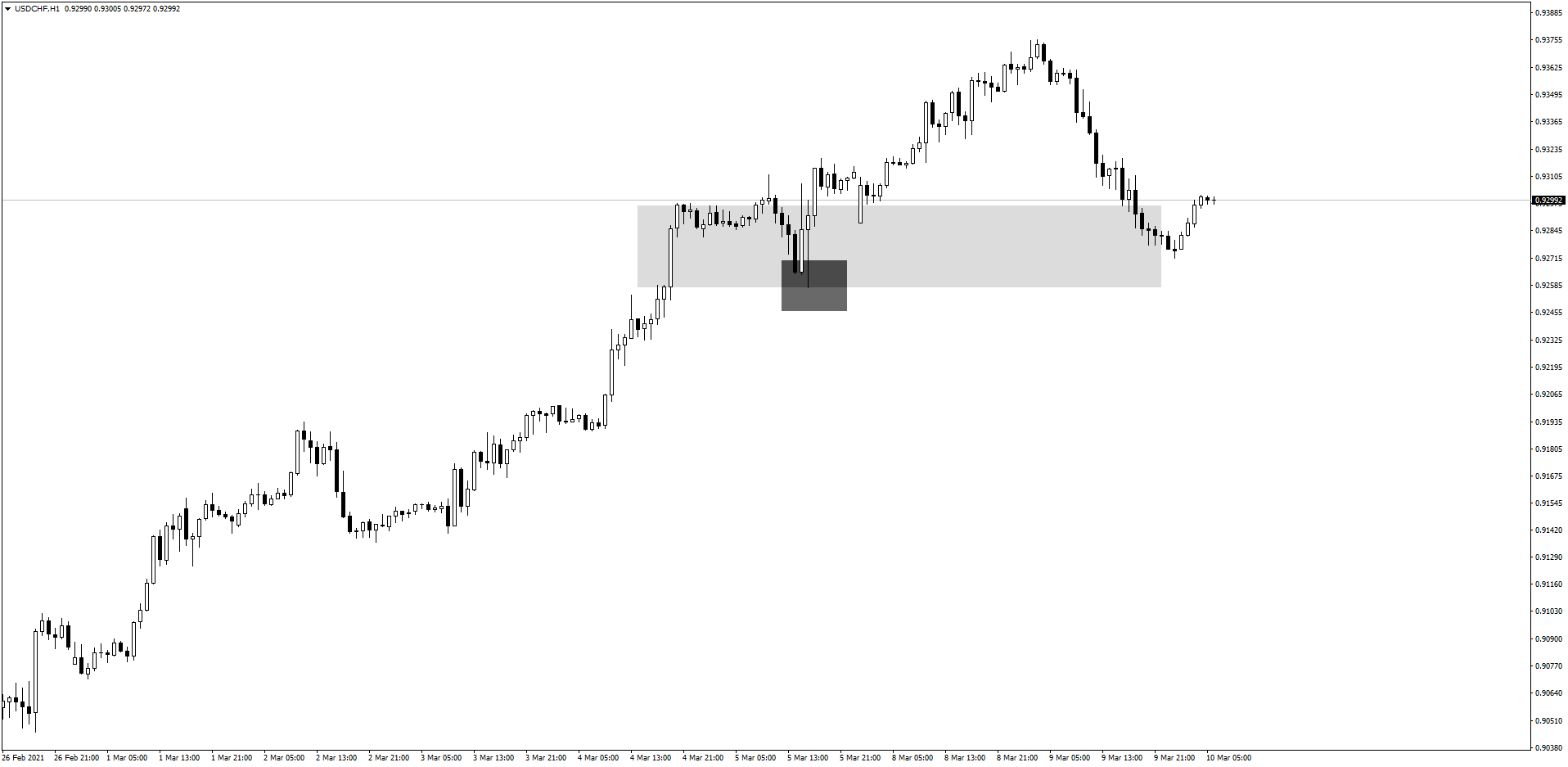
I'm bearish the USD/CHF right now based on the daily chart, but if you're an intraday trader you might be bullish, based on the hourly chart:
Let's look at the weekly chart for the USD/CAD:
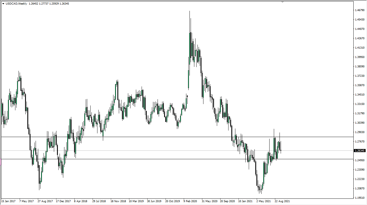
This pair has been on a downtrend and it's approaching the range marked by the grey rectangle, which it may use as a reversal.
But the hourly chart shows that it's a bit messy right now, and hard to find a clean entry point to get in a trade:
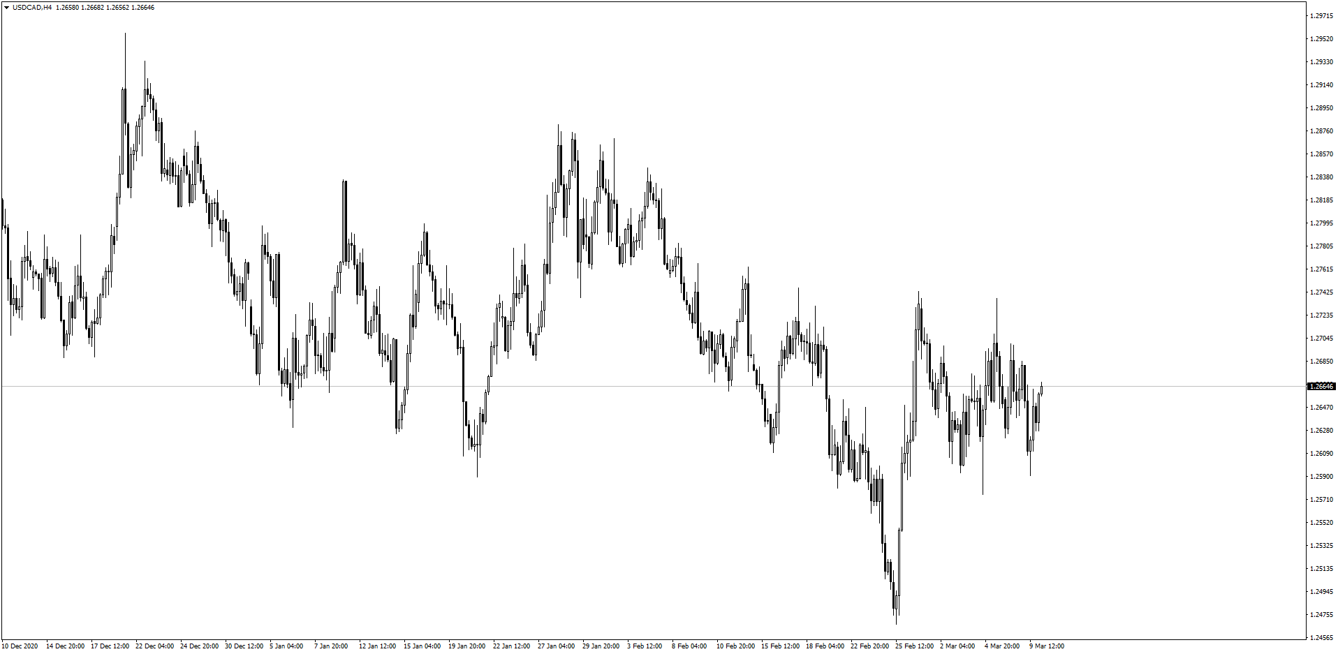
Remember, you want to enter clean trades. So if a chart isn't very clear to you, stay away from it until you find a better chart, timeframe or even trade altogether.
Lastly, always mind your risk. Set stop losses with good ratios so you can trade safely.
