What are Renko Trading Strategies and How Do They Work?
Many types of Renko strategies exist—some use indicators, while others use a raw price chart. Some strategies use small box sizes, so they are intraday strategies, while others use large box sizes to create swing strategies.
I prefer Renko strategies without indicators. Renko charts simplify the price action (the whole point of this type of chart), and indicators can perform poorly without the level of detail in time-based charts.
Trend Following Using Renko Charts
Because of the clarity of Renko charts, they are ideal for seeing trends. Remember, I can use a Renko to find trends and then switch to candlestick charts for the extra details to execute trades.
Support and Resistance Role Reversal
The simplification of price action in Renko charts makes it phenomenally easy to see support turning into resistance and vice versa, providing clean entry opportunities. Let us look at the EUR/USD 50-pip Renko chart.
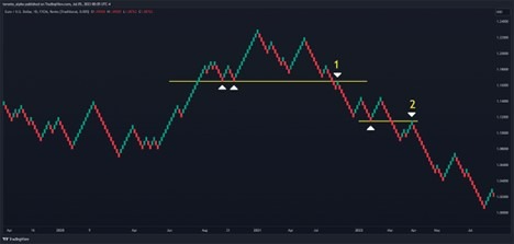
Point 1: This is an excellent signal at the beginning of a major reversal allowing an entry right at the beginning of a new downtrend. The Renko bricks make two support levels at the beginning of the reversal area. The price tests this with a single green brick (point 1) as a resistance level. It is a clear short signal once the price immediately forms the next red brick.
Point 2: Now that the downtrend is underway, a new support level turns into resistance at point 2 to provide another short entry into the downtrend.
Renko Swing Failure Strategy
The “swing failure” strategy is like the strategy Charles Dow outlined in the 1920s. In this strategy, the price makes a new high in an uptrend followed by a lower high. The swing point between the two highs is broken and retested as resistance to provide a short entry. Reverse these rules for a long entry.
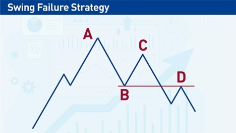
Now let’s see how this strategy plays out on the EUR/USD Renko chart we looked at earlier.
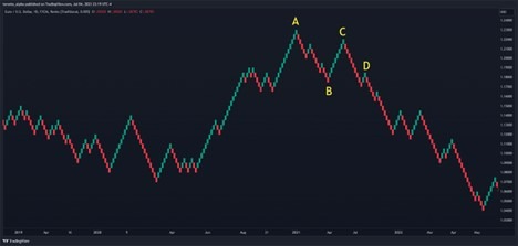
Notice how, at point D, the Renko bars reverse and change colours near the swing low at point B. The colour change at point D provides a perfect short entry.
Where Does the Renko Chart Come From?
Although Renko charts are not the primary type of chart used by traders today, they were part of the birth of technical analysis. Around the late eighteenth century, a rice merchant from Sakata, Japan, Munehisa Homma, created visual aids to keep track of price changes. Over the decades and into the nineteenth century, other merchants refined his original ideas, eventually resulting in the system of candlestick charting that we use today.
Renko charts originated around this period. Remember, this was a time before any computer—merchants would gather price data of rice from messengers located in distant lands and turn this data into charts. They did everything by hand and could not change timeframes or settings at the click of a mouse button as we can today! So charting techniques had to be simple, easy to interpret, and robust—Renko charts possess these qualities.
How to Use the Renko Chart
First, let’s look at how Renko charts are constructed.
Renko charts are price-based.
This makes them different from traditional charts, i.e., candlesticks, bar charts, and line charts, which are all “time-based.”
For reference, time-based charts are built with set increments of time. For example, a 5-minute chart will create a new candlestick, bar, or point in the line every 5 minutes.
In contrast, a Renko chart will create a new data point after the price has moved by a predetermined distance. There is a school of thought that using a time period to create a new candle or bar is arbitrary—after all, we do not trade time, we trade price—and using the price to create new data points is much more reflective of a trader's reality. This is especially true when looking at the days of physical trading floors before computers took over in the 1990s. Traders then would only see and hear price changes undivided into units of time.
Renko charts are made from “bricks.”
The word Renko comes from the Japanese word “Renga,” which means bricks. A Renko chart is a series of bricks, and each brick appears on the chart when the price has moved by a predetermined amount, called the “box size.” The box size can be a fixed amount, e.g., 50 pips or an average true range.
The horizontal time axis is uneven in Renko charts. Some bricks may form quickly if the price moves rapidly, while others may take a while during quieter times. On a Renko chart, there is a time scale on the horizontal axis at the bottom, but it will not be even. For example, ten Renko bricks may cover a year of trading in one part of the chart but only cover a few months in another part of the same chart.
Let’s look at an actual Renko chart. This is the EUR/USD currency pair, and the box size is 50 pips.
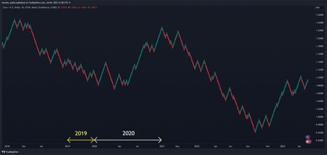
Notice how 2019 is much shorter on the horizontal time axis than 2020. That means 2020 had much more activity and price movement than 2019.
Renko boxes change colour.
An interesting feature of Renko charts is that for a box to change colour from green to red or vice versa means the price must travel double the distance. Let’s say the last box is green, and the box size is 50 pips. For the following box to be red, the price must move back down the length of the last green box, 50 pips, and then down another 50 pips to create a red box, i.e., 100 pip move. So, a change in box colour means a significant reversal. This highly visual clue helps to make Renko charts an excellent tool for spotting key reversals.
Renko Chart Patterns
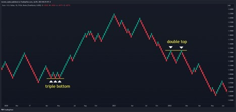
All the classic chart patterns seen on time-based charts can also be visible on Renko charts. These include:
Continuation patterns: triangles and wedges
Reversal patterns: double/triple tops and bottoms, head and shoulders
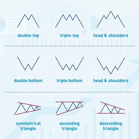
Let’s see a couple of examples on our EUR/USD 50-pip Renko chart:
Which Timeframe is Best for Renko Charts?
Renko charts do not have traditional timeframes like time-based charts (candlesticks, bar, and line charts). Instead, each Renko brick is a predetermined size, known as the “box size.”
It takes a little experimenting to find the right box size—one way is to back-test trades on different box sizes and ask if I am comfortable with how long those trades would last. If I want swing trades lasting weeks, and I find that the back-tested trades last 2-4 weeks, I will keep that box size. If I want shorter-term trades, I will reduce the box size.
Is Renko Better than Candlesticks and Heiken Ashi?
Renko vs. Candlesticks
To compare Renko with candlesticks is to compare apples with oranges. One is not better than the other—instead, they serve different functions. Renko charts remove minor fluctuations in price but highlight trends and key levels.
However, Renko does not show how or if a trend is accelerating or slowing down, i.e., the momentum of price, which can be as important as direction depending on the trading strategy.
Renko vs. Heiken Ashi
Heiken Ashi is time-based but has some of the smoothing-out features of Renko bars. For some traders, it offers the best of both worlds. However, Heiken Ashi does not provide the same clarity as Renko. Since traders can switch easily between Renko and candlesticks on most platforms, they may use the best of both and skip using Heiken Ashi.
Renko Charts—Pros and Cons
Pros
- Clarity. Renko Bars offer tremendous clarity to see trends and, support & resistance levels.
- Easy to evaluate ideas. Because of how simple Renko charts are, it is easy to go back and test trading ideas.
Cons
- Oversimplified. Renko bars remove a lot of detail compared to time-based charts, and many traders find that they cannot use Renko by itself.
- Not all platforms support Renko. This may mean switching or running an additional platform to view Renko charts.
- Not as popular as time-based charts. This can be a drawback if having a community of traders is important.
Bottom Line
Renko charts are an excellent way to see trends and reversal areas. They provide a level of clarity that almost no other chart type provides.
Renko differs from time-based charts (candlesticks, bar, and line charts) because it relies on price moving a certain distance to print a new “Renko brick” rather than a brick at set time intervals.
However, Renko removes a lot of details that some traders may find too important to miss.
FAQs
Is Renko a good strategy?
Yes, Renko is an excellent way to spot trends, support & resistance, and reversal.
What is the best time frame for Renko?
Experiment with the box size for Renko. A common size is an ATR of 14.
What is the best setting for Renko?
A common setting is a 14-period ATR.
Is Renko profitable?
Renko can be very profitable for trend following and support and resistance trades.
Do professional traders use Renko charts?
Yes, some professionals use Renko as part of their toolkits.
Is Renko better than Heikin Ashi?
Renko provides more clarity, but Heikin Ashi gives more detail.
Is Renko good for scalping?
Traders can use Renko for scalping because it can simplify the decision-making process.
Is Renko good for swing trading?
Yes, Renko is excellent for swing trading because it shows clear trends and reversal areas.
Is Renko good for intraday trading?
Renko can help intraday trading by showing trends developing during the day.
