 Over recent days I’ve laid out two pieces of evidence with statistics, showing how you can identify a statistically positive trading edge in major Forex pairs, and in certain commodities and stock indices. Today I’ll turn to another method of analysis you can use to improve this edge even more or use as a filter to know when to trade with smaller or larger position sizes.
I began by defining a trend as any time a daily candle closes above both the 10-day and 50-day moving averages, with both of those averages up from their previous day’s value. That defines an uptrend, a downtrend occurs when the situation is reversed (i.e. below and down).
What if there is a way to judge the strength of the trend by measuring the relative positions of these moving averages? Happily, there is: firstly, whether the SMA 10 is above the 50, and if so, by how much. What I am expecting is that the historical edge should be stronger where the SMA 10 is above the SMA 50, and even stronger when there is a gap between the two averages of at least, say, 25% of the value of the current ATR 15 indicator. You might have read that trends are stronger when there is a healthy separation between in the moving averages – this is what I am looking for.
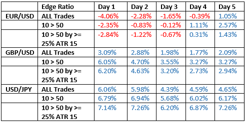
Here are the results of my back test covering the three major currency pairs:
So, we can see that paying attention to the position of the moving averages pays off, and regardless of some slight variations, the statistics above seem to show that when the faster moving average is ahead of the slower one, and when the position of the trend is more established, we get superior odds in the direction of the trend.
Don’t forget that the edge ratio I am showing here is simply the average maximum favorable movement over the time period divided by the average maximum unfavorable movement. Yet this statistic is a good and pure way to determine whether a statistical edge exists within a back test.

